This is the first of a series of articles on the design of simple graphs – graphs you could draw with pencil and ruler but are now more likely to be produced using software. You can find examples in the book Plain Figures1 covering the presentation of statistics by graphs and tables. Despite that and other sources of advice, simple two-dimensional graph forms often fail to communicate as their maker intended – or so one assumes.
Computer “visualisations” often strike me as misguided. Those, in particular, that involve a simulated third dimension or animations may show off sophisticated computing power, but the outcome is style over substance.
My contention over many years has been that many simple graphs in published papers are not edited or proofread with anything like the attention paid to text. Such graphs may as a result be confusing, ambiguous or actually in conflict with the message in the text. It has been easy for several decades to generate graphs using popular software on personal computers; unfortunately, the assumption has been that because a graph came directly from data it must be in some sense “correct”.
I hope these articles will be read as constructive debate, drawing attention to aspects where clarity can be improved. It is, however, an unusual activity, and some authors, I have found, resent the inference that they may have failed. As one journal editor wrote to me, “Nobody else has flagged this up as an issue, and if poor graphical presentation of data were sufficient basis for a published critique, then the pages of journals would be full of them.”
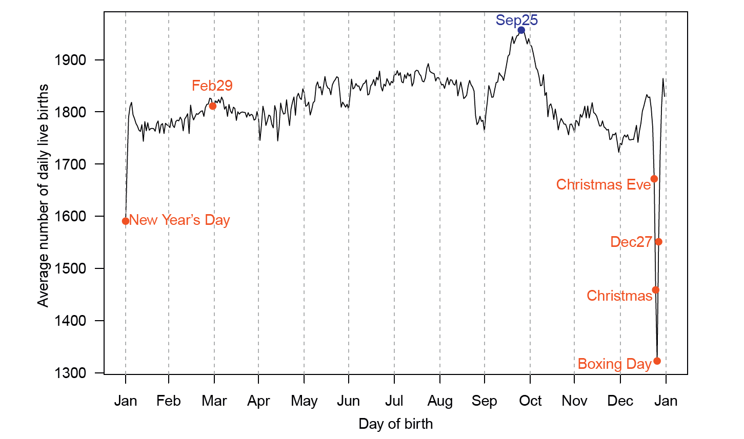
It is virtuous to start with a little selfexamination using an example from Significance. Figure 1 in “What is the most popular birthday in England and Wales?”,2 reproduced here also as Figure 1, shows a simple line graph of the data series for the numbers of births for each calendar date averaged over 36 years.

FIGURE 1 The original graphic, showing mean frequencies of live births by birthday in England and Wales, 1979–2014.
While the graph is arithmetically correct, it can be improved as a presentation. An important distinction must be made between graphs drawn during the course of analysis as tools for insight, and graphs drawn after the analysis as a presentation for communicating results. Just as writers must choose words and place them in order to clarify or stress meaning, graphs need to be considered and revised to emphasise the intended message.
The first point is that the main feature of the graph occurs over the end of the year. The reader has to mentally join up the peak on 30/31 December with the low value on New Year’s Day. One technical fix suggested for cyclic data is to duplicate part of the cycle: repeat the line for January at the right. That would also allow more space to label the point for 27 December on its right so that it does not appear to fall between Christmas Eve and Christmas Day. My preference, however, is to move the origin and start the year at a bland part of the cycle. For example, starting at 1 March brings all the interesting parts of the line towards the centre; it also moves the leap day, 29 February, which is notably unremarkable, to the end – almost an afterthought.
The vertical range of the plot was apparently determined by the range of data (using round values probably selected by the software). Hence the importance of the drop is not made visual. It is a standard trick in advertising and public relations to scale thus so as to make changes, for example in share price, look either trivial or dramatic. One very common injunction for scientific graphs is that you must always include zero. While once again arithmetically correct, the result may be to make changes appear less than interesting. Inserting a break in the axis, with zero at a completely arbitrary distance, is an utterly illogical suggestion.
Rather than follow blind rules, one needs to consider what comparisons are being presented, and hence what is the relevant reference value. Here it is the usual range of day-to-day variation, or some measure that distinguishes short periods of large fluctuation from the apparent general cyclic trend. This graph is expository rather than suggesting some physical relationship. Adding lines at percentiles of the data gives a visual indication of the Christmas drop compared to the “usual range”. Making the mean (the median is almost identical) bolder makes the seasonal pattern over spring and summer more evident.
The revised graph (Figure 2) is labelled with the data values on one side and proportions of the mean at chosen percentiles on the other. Labelling will be discussed in more detail in another column.

FIGURE 2 The revised graphic, again showing mean frequencies of live births by birthday in England and Wales, 1979–2014.
The day-to-day variation shown by the plotted line might be random, but when investigated in months without public holidays we find a regular weekly periodicity. You might hope that averaging over years would eliminate day-of-week effects, except that over 36 years the combination of weekdays changes from date to date. The original article highlighted a weekend effect. The pattern of leap days makes it very hard to find a span of years that does not suffer this problem.
Showing variation that is an artefact of the period of observation is distracting in a presentation. A solution is to smooth the daily counts with a seven-day running mean for each date, remembering that the dates wrap round at the end of year. The daily values can still be shown, but faded into the background, except over the Christmas period when fixeddate holidays predominate. It is worth noting that 27 December may be a public holiday when Christmas Day falls on a weekend; this happens in 10 out of 36 years. The smoothed line also shows more clearly the dips at the start and end of May and end of August, where public holidays vary annually over a small range of dates.
Figure 2 makes these and other changes. The choices made are, like the choices of words in the text, personal and cannot be claimed to be unique or definitive. A design problem has no uniquely right answers, but there are questions that should be asked. What is clear now is that the 10% of values that, by definition, occur outside the 5th and 95th percentiles do so in the September peak or on public holidays.
Acknowledgements
Thank you to Mario Cortina Borja who provided a copy of the data used in his article; there are small and unimportant differences from values on the Office for National Statistics website. Figure 2 was drawn using Stata 12 for Windows. Running means with wraparound for cyclic data were calculated by a Stata function movsumm written by Nick Cox.
About the author
Allan Reese is an independent statistical consultant and member of the Significance editorial board.
References
- Chapman, M. and Wykes, C. (1996) Plain Figures. London: The Stationery Office. ^
- Cortina Borja, M. and Martin, P. (2017) What is the most popular birthday in England and Wales? Significance, 14(1), 6–7. ^


