

Imagine there is a country called Bayesland that is divided into two distinct geographical areas – North Bayesland and South Bayesland – with equal population sizes. The country has been struck with a new, novel, infectious disease called P-STAT. Statistics reveal that the death rate for this disease for Southerners is twice that of the death rate for Northerners in each different age category (Table 1).
Table 1: Death rates for the fictional P-STAT disease, disaggregated by age.
| Deaths per million | ||
| Age < 65 | North Bayesland | 3 |
| South Bayesland | 6 | |
| Age 65+ | North Bayesland | 2,001 |
| South Bayesland | 4,000 | |
From a public policy perspective, it would seem reasonable to focus resources on Southerners. However, suppose the statistics also reveal that – when we aggregate the data over all age groups – the death rate for Northerners is 40 times that of the death rate for Southerners (Table 2). Who do you now believe is at greater risk?
Table 2: Death rates for the fictional P-STAT disease, aggregated.
| Deaths per million | ||
| Total | North Bayesland | 1,002 |
| South Bayesland | 26 | |
The initial reaction by most people when presented with such information is to assume that this is some kind of deception – that there surely cannot be such a complete reversal in the death rates simply by looking at the data in a different way. But there is no deception, as the full data in Table 3 shows.
Table 3: Aggregated vs disaggregated data for the fictional P-STAT disease.
| Deaths | Population | Deaths per million | ||
| Total | North Bayesland | 2,004 | 2,000,000 | 1,002 |
| South Bayesland | 52 | 2,000,000 | 26 | |
| Age < 65 | North Bayesland | 3 | 1,000,000 | 3 |
| South Bayesland | 12 | 1,990,000 | 6 | |
| Age 65+ | North Bayesland | 2,001 | 1,000,000 | 2,001 |
| South Bayesland | 40 | 10,000 | 4,000 | |
This situation – where drilling down into each sub-category gives results that are the ‘opposite’ of the aggregate result – is well known in statistics and is an example of Simpson’s paradox.1 Normally, statisticians look first at the aggregated data, and the paradox only becomes evident when they then look at the disaggregated data. It is widely assumed that, once Simpson’s paradox has been revealed in cases like this, it is the disaggregated data that correctly identifies the group most ‘at risk’. So, this might suggest that public policy should target Southerners and not Northerners as was initially assumed. However, things are not so clear-cut.
Simpson’s paradox can arise when there is an underlying causal explanation in the data that might not be initially obvious.2,3 In this case it is that Northerners are much more likely to be over 65 than Southerners, and the disease is far more deadly to those aged over 65 (see Figure 1).
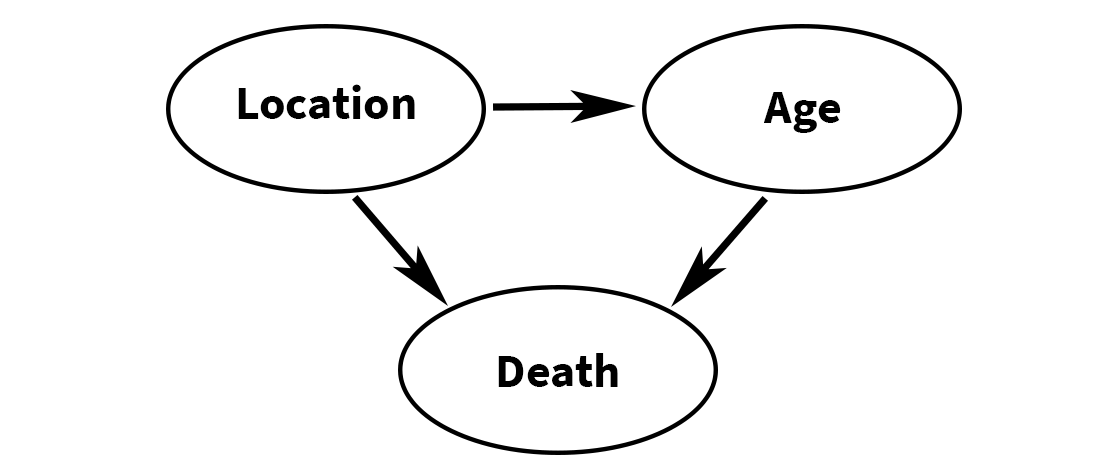
Figure 1: Causal explanation for observed data and Simpson’s paradox.
What relevance should this have on our policy decision? Established authorities already recognise the role that age plays in fatality statistics and recommend ways in which different age distributions can be considered when calculating aggregate risk. For example, the World Health Organization (WHO) calculates an “age standardized death rate”. If the age categories are as above, it is defined as:
(<65 death rate) × (population proportion <65) + (65+ death rate) × (population proportion 65+)
But this definition is equivalent to the overall death rates provided in the final column of Table 3. Therefore, according to the WHO, the age standardized death rate for North Bayesland is 1,002, and for South Bayesland is 26. This conflicts with the assumption – based on identifying Simpson’s paradox in the disaggregated data – that it is the Southerners who have the higher death rate. So, any public policy which solely uses the disaggregated data, and prioritises Southerners in tackling P-STAT disease, would clearly be irrational.
The key point is that age is a much more important risk factor here than location. The death rate for people aged 65+ is nearly 270 times greater than those aged under 65 (2,002 compared to 75). So, any public policy decision should take this into account.
Replacing ‘location’ with ‘ethnicity’ in the real world for Covid-19
It turns out that our real-world situation, with the ongoing pandemic of coronavirus disease (Covid-19), has similarities with the Bayesland example if we replace ‘location’ with ‘ethnicity’.
Based on data that has been gathered regarding specific demographics at higher risk of dying of Covid-19 in several countries, we are informed that older adults (65+) and people who identify as Black, Asian and Minority Ethnic (BAME) individuals are in the high mortality risk group. (Note: while “BAME” was the official term used in the reports referred to in this paper, the UK government has since recommended avoiding use of this term, and a Lancet article recommends it is replaced with the term “racially minoritized”.)
Using data collected by the USA’s Center for Disease Control (CDC), Dana Mackenzie has shown that Simpson’s paradox is evident when comparing Covid-19 fatality statistics for non-Hispanic white people and non-white people: while the overall rate is higher for non-Hispanic white people, in each main age sub-category it is higher for non-white people. Mackenzie’s causal explanation is the same as that presented in our hypothetical example: non-Hispanic white people (like Northerners) are more likely to be over 65 than non-white people (like Southerners), and it is the 65+ group that is most at risk of Covid-19 death. But, irrespective of Simpson’s paradox, the WHO age-adjusted death rate is higher for non-Hispanic white people than non-white people.
By repeating our analysis, we examined whether Mackenzie’s results were replicated in the England and Wales Covid-19 death statistics by ethnicity, as collected by the Office for National Statistics (ONS). At the time of first writing this article, the most recent ONS report on Covid-19 deaths by ethnicity was that published in May 2020. There was extensive national media coverage of the results of this report, with every major newspaper and TV news channel in the UK focusing on the following especially worrying point:
“When taking into account age in the analysis, Black males are 4.2 times more likely to die from a Covid-19-related death and Black females are 4.3 times more likely than White ethnicity males and females”.
In our research, we analysed this ONS report and we argue that it did not provide sufficient data or information to support its conclusions: it provides the total fatalities per ethnic group, including a breakdown of these for the <65 and 65+ age categories, but does not provide critical information about the assumed proportion of white people and black people in the population. The conclusions that can be drawn are highly sensitive to small changes in population demographics. To illustrate, we present two different scenarios: one using data from the 2011 census and one using more recent population estimates, as shown in Table 4.
Table 4: UK Covid-19 death rates between 1 February 2020 and 10 April 2020, based on assumed England and Wales population of 62,411,850*. Simpson’s paradox is evident in the “2020 estimate” column but not the “2011 Census” column, as shown by the highlighted highest death rates in each category.
| Data from ONS report | 2011 Census | 2020 estimate | ||||
| Population: 85% white, 3.4% black | Population: 78% white, 5.8% black | |||||
| 14% of white people aged 65+, 5% of black people aged 65+ | 14% of white people aged 65+, 5% of black people aged 65+ | |||||
| Fatalities | Population | Fatalities per 100K | Population | Fatalities per 100K | ||
| Total | White | 10,726 | 53,050,073 | 20.2 | 48,681,243 | 22.0 |
| Black | 766 | 2,122,003 | 36.1 | 3,619,887 | 21.2 | |
| Age < 65 | White | 1,036 | 45,623,062 | 2.3 | 41,865,869 | 2.5 |
| Black | 185 | 2,015,903 | 9.2 | 3,438,893 | 5.4 | |
| Age 65+ | White | 9,690 | 7,427,010 | 130.5 | 6,815,374 | 142.2 |
| Black | 581 | 106,100 | 547.6 | 180,994 | 321.0 | |
*The most recent ONS report on UK population (Office for National Statistics, 2019) estimates the mid-2019 population of England as 56,286,961 and Wales as 3,152,897. It also estimates annual growth of 0.5%. Hence, we estimate current England and Wales population of 62,411,850.
Although 9 years out of date, the 2011 UK census is the most recent UK census with reported population proportions (85% white, 3.4% black). The 2020 estimated proportions (78% white, 5.8% black) are based on more recent estimates including extrapolations from the 2011 census about population changes in the previous 10 years. In both scenarios, we use the most recent ONS report on population age by ethnicity, which confirms that, indeed, white people are a much older population than black people: 14% of white people are 65+ compared to only 5% of black people.
Simpson’s paradox is evident in the 2020 estimate scenario where we see that, despite the death rate for white people being slightly higher overall, the death rates for black people are more than twice that of white people in each disaggregated age subcategory. These results are not consistent with the ONS report conclusions. However, those of the 2011 census scenario are: although Simpson’s paradox is not evident here, in each age category the death rate for black people is about four times that of white people, as stated in the ONS report. This strongly suggests that the ONS analysis was based on the out-of-date 2011 census data.
We emailed the ONS to ask whether this was the case but received no response. It was only by consulting a later report on the same topic that we finally answered our question. In that report, dated June 2020, the ONS writes: “Our research was based on linking deaths to the 2011 census, the most timely data available, including people aged 9 years and over; we used a regression model to adjust for specific characteristics for people in private households at the time of the 2011 Census, and we aim to undertake further analysis that takes into account other characteristics such as pre-existing conditions in future projects.” We find it curious that the ONS believes this 2011 data is “the most timely available” rather than use its own mid-2019 estimates updated for 2020. It is also interesting to note that in the same report, ONS revised the difference in death rate between black and white males down from 4.2 to 2.9, and for females from 4.3 to 2.3, based on updated death statistics. However, it is the figures in the original report that remain in the popular narrative.
Irrespective of whether we use the 2011 or 2020 estimates for our analysis, in each age subcategory the death rate for the period in question (1 February 2020 – 10 April 2020) for black people was over twice that as for white people. So, for any given age range, a black person was over twice as likely to die of Covid-19 than a white person of the same age (see “Absolute versus relative risk”). Based on this presentation of the statistics we again ask the question: Which of the two groups (white people or black people) is at higher risk of dying from Covid-19? The problem again is that the answer is not as clear-cut as it seems – even when using the 2011 census data. What the ONS calls the ‘age adjusted figure’ (and which appears to be the result of some kind of averaging of the individual age category rates) is very different from the WHO definition of the age standardized death rate. As we noted, the WHO definition is equivalent to the overall death rate. So, in the 2011 census scenario it is higher for black people (36.1) than white people (20.2) but nowhere near the four times ‘age adjusted’ figure claimed by the ONS, while in the 2020 estimate scenario it is higher for white people (22) than black people (21.2).
As in the case of our hypothetical Bayesland example, finding that the death rate for black people is higher than white people in the disaggregated data does not mean that the focus for public policy should be ethnicity. In either of the scenarios we considered, while both ethnicity and age are clearly shown as ‘risk factors’, of the two, it is age which is the dominating factor. In fact, whereas the death rate for black people in each age group was between 2 to 4 times greater than that of white people, the death rate for those aged over 65 was 54 times that of those aged under 65 (146.8 per 100K compared to 2.69 per 100K based on the 2020 estimates).
Conclusion
There has been great concern about the increased risk of Covid-19 to the Black and Minority Ethnic (BAME) community. Our analysis of Covid-19 deaths between 1 February 2020 and 10 April 2020 suggests that, while there was an increased risk to BAME persons over white persons, the conclusions stated in the widely-covered May 2020 ONS report may have created an unjustified level of fear and anxiety.4,5
As in our previous related studies,6-8 our analysis has shown the need for causal models and explanations to supplement traditional statistical analysis. Here we have shown that age is a much more important risk factor for Covid-19 death than ethnicity, and the Simpson’s paradox observed for black versus white death rates is explained by the fact that there are far more elderly white people than black people in the population. Moreover, the increased risk to the BAME population may be partly explained by environmental risk factors such as poverty, social distancing practices, occupations, and diet rather than ethnicity9,10 (although one study disputes the extent11).
Absolute versus relative risk
We believe that, on reflection neither the age-specific death rates nor the age standardized death rates are especially useful as they exaggerate the real risk to people. Leading statistician and risk expert David Spiegelhalter has convincingly argued why it is better – when discussing risk – to use absolute, not relative, risk differences and to express these as expected frequencies.12
With this approach, based on the ONS data for the period 1 February 2020 – 10 April 2020 (under our 2020 population estimates) we can conclude:
- For every 100,000 black people under 65, we expect about 3 more to die of Covid-19 than for every 100,000 white people (5.4 compared to 2.5 respectively in total). Equivalently, a black person under 65 has a 0.0029% increased probability (about 1 in 35,000) of dying compared to a white person under 65.
- For every 100,000 black people aged 65+, we expect 179 more to die of Covid-19 than for every 100,000 white people (321 compared to 142 respectively in total). Equivalently, a black person aged 65+ has a 0.179% increased probability (about 1 in 600) of dying compared to a white person aged 65+.
About the authors
Norman Fenton is professor of risk information management at Queen Mary University of London, a fellow of the Alan Turing Institute, and a director of Agena, a company that specialises in risk management for critical systems.
Martin Neil is professor in computer science and statistics at Queen Mary University of London, a fellow of the Alan Turing Institute, and a joint founder of Agena.
Scott McLachlan is a postdoctoral researcher in computer science at Queen Mary University of London.
Magda Osman is a reader in experimental cognitive psychology at Queen Mary University of London, and a fellow of the Alan Turing Institute.
References
- Simpson, E. H. (1951) The Interpretation of Interaction in Contingency Tables. Journal of the Royal Statistical Society, Series B, 13, 238–241.
- Fenton, N. E., Neil, M., & Constantinou, A. (2019) Simpson’s Paradox and the implications for medical trials. Retrieved from http://arxiv.org/abs/1912.01422.
- Pearl, J. and Mackenzie, D. (2018) The Book of Why: The New Science of Cause and Effect. New York: Basic Books.
- Over three-quarters of BAME doctors fear they will contract Covid-19. The Guardian. [Online]. Available from: https://www.theguardian.com/society/2020/may/18/over-three-quarters-of-bame-doctors-fear-they-will-contract-covid-19. [cited 18 June 2020].
- Otu, A., Ahinkorah, B. O., Ameyaw, E. K., Seidu, A.-A. and Yaya, S. (2020). One country, two crises: what Covid-19 reveals about health inequalities among BAME communities in the United Kingdom and the sustainability of its health system? International Journal for Equity in Health, 19(1), 189. https://doi.org/10.1186/s12939-020-01307-z
- Fenton, N. E. (2020) A Note on UK Covid-19 death rates by religion: which groups are most at risk? Retrieved from http://arxiv.org/abs/2007.07083
- Fenton, N. E., Neil, M., Osman, M. and McLachlan, S. (2020) Covid-19 infection and death rates: the need to incorporate causal explanations for the data and avoid bias in testing. Journal of Risk Research, 1–4. https://doi.org/10.1080/13669877.2020.1756381
- Neil, M., Fenton, N. E., Osman, M. and McLachlan, S. (2020) Bayesian Network Analysis of Covid-19 data reveals higher Infection Prevalence Rates and lower Fatality Rates than widely reported. Journal of Risk Research. https://doi.org/10.1080/13669877.2020.1778771
- Raharja, A., Tamara, A. and Kok, L. T. (2020) ASSOCIATION BETWEEN ETHNICITY AND SEVERE COVID-19 DISEASE: A SYSTEMATIC REVIEW AND META-ANALYSIS. MedRxiv, 2020.08.12.20157271. https://doi.org/10.1101/2020.08.12.20157271
- Philipose, Z., Smati, N., Wong, C. S. J., Aspey, K. and Mendall, M. A. (2020) Obesity, old age and frailty are the true risk factors for COVID-19 mortality and not chronic disease or ethnicity. MedRxiv, 2020.08.12.20156257. https://doi.org/10.1101/2020.08.12.20156257
- Raisi-Estabragh, Z., McCracken, C., Bethell, M. S., Cooper, J., Cooper, C., Caulfield, M. J., … Petersen, S. E. (2020) Greater risk of severe COVID-19 in Black, Asian and Minority Ethnic populations is not explained by cardiometabolic, socioeconomic or behavioural factors, or by 25(OH)-vitamin D status: study of 1326 cases from the UK Biobank. Journal of Public Health, 42(3), 451–460. https://doi.org/10.1093/pubmed/fdaa095
- Spiegelhalter, D. (2019) The Art of Statistics: Learning from Data. London: Pelican.


