

Another ranking that is topical (in Higher Education circles at least) is those that will arise from the National Student Survey – BSc Mathematics in general have quite high satisfaction scores and relatively small class sizes. So relative rankings can change quite dramatically year on year with only random variation from the true underlying 'satisfaction rating' of a degree programme.
I decided to simplify the issue and to simulate it to illustrate the major problem.
I took 16 different percentages (or the associated probabilities of success / satisfaction) – from 80 – 95%. For each of these values I modelled five sets of data, each representing 15 years of data, with the potential sample sizes (number of respondents) varying at random between 45 and 55.
I then modelled the number of successful (or satisfied) students and hence the proportions – which depend on the corresponding sample sizes. These proportions were then turned into annual ranks – so in each of the 15 'years' an institution would have been ranked between 1 and 80 (with, for clarity, the lower ranks indicating better performance).
The graph below illustrates the problem. The black dots indicate the median rank across the 15 'years' of data. The red dot represents the 'true' ranking – located in the centre of each of the groups of institutions with tied true rankings. The grey dashed lines in the background show the span of values of the rankings given year-on-year. Many of these dashed lines span almost the entire range of possible rankings!
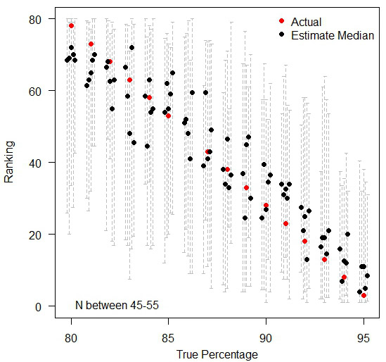
The variation in rankings between 80% and 95%, you can see how the background data for each ranking (the median of five datasets in black dots and the span of values year-on-year in dashed lines) actually introduces a huge amount of noise that the 'actual' ranking hides.
Moral of the story is, when comparing many institutions with very similar performances, ranks are meaningless in practice. If anything needs to be compared, compare the raw values (%) so that people can see how little difference there exists in practice – as you can see below, by treating each institution in isolation, the random variations over time still exist, but people can judge for themselves as to whether any observed difference is large enough to cause real concern. A jump of three percentage points may have a dramatic difference in the ranking position when everyone is tightly bunched together.
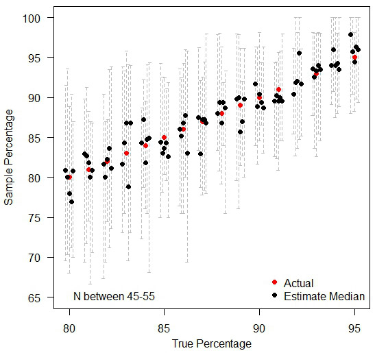
Treating each institution in isolation.
This article first appeared on Deirdre's personal blog.
Footnotes
- I chose the range 45-55 as it is a common range for the number of responses in the National Student Survey for BSc Mathematics degrees. I think this range is sensible because if you look at Bristol data for Key Stage 2 performance in primary schools, the median range is similar. Of the 29 schools with a minimum of 85% achieving level four or above in reading, writing and maths at Key Stage 2, the numbers of eligible students in each of these schools range from 20 to 91, with a median of 45 students.


