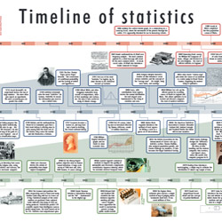

Significance magazine has been going for ten years. To mark its birthday we have published a fold-out timeline of more or less everything that is important in the history of statistics. And as Kipling hinted, history is a story. If you don’t know the story of statistics, you don’t know statistics at all.
Our pull-out-and-stick-on-the-wall chart is meant to entertain and to inform statisticians, but it is meant for everyone else as well. It has got nice coloured pictures, easy-to-understand descriptions – 70-odd of them, many of them mini-stories a la Kipling – of all (we hope) the important landmarks of thought and of application that have made statistics the tool, the discipline and the very necessary help to human endeavour that they are today. The first of them was in 450 BC, when a chap by the name of Hippias had the bright idea of trying to work out the date of the first Olympic games. He knew how many kings had reigned since then, but he didn’t know exactly how long each king had reigned. So he used the average length of a reign to do his sum.
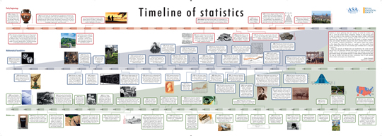 Fast-forward though Indian, Chinese and Arabic ventures – Al-Kindi was using frequency analysis in 840 AD to break secret codes; the Chinese were well up to binomial coefficients and what the west would later call Pascal’s Triangle by the year 1303 – to Gauss and his ilk. (And Casanova. You’ll have to look at the timeline to find how he gets in there.) You get charts of Napoleon’s march on Moscow, and Florence Nightingale’s coloured diagrams of death-rates in Crimean hospitals – which were far more important than the lamp that she carried through the wards. The 20th century brings theoretical and practical giants like Fisher, and Alan Turing breaking Engima wartime codes at Bletchley with the world first programmable computer, and statisticians outperforming spies in estimating the number of German tanks there would be on the D-day beaches. More recently we have Doll and Hill proving that smoking causes cancer. Climate change and big data bring us to Hal Varian telling us that statistics is the sexy profession of the next ten years, and Moneyball and Nate Silver making that prediction come true.
How did we choose them? By Trial, error, and sitting in the bath waiting for inspiration. Also by asking for your suggestions. Have we left any out? Almost certainly. Tell us which omissions you think we have made, and why they should be put in, and we will try to give an update. Or tell us which ones you think should not be there – should Margaret Thatcher be there, as the first world leader to accept the need to do something about climate change?
The timeline is in the December issue of Significance magazine. You can detach it to stick on notice-boards, classroom walls or anywhere else that people might see it. Or you can download it from here and print out more copies for yourself. It is high resolution, so for best effect print it as big as your printer, or your copyshop’s printer, will let you. It is meant to get even those who have never thought of statistics before in their lives to look at it and think that perhaps statistics have something interesting to offer after all.
The 'timeline of statistics' was designed by Tom Fryer at Sparks Publishing Services.


