
If you watched public television in the US at any point in the 1980s or 1990s, then you have probably heard of the painter Bob Ross. Ross hosted 401 episodes of The Joy of Painting, an instructional painting show, for just over 11 years. He was known for his calming voice, cheerful demeanor, and quick, talented brushstrokes.
After watching only a few episodes of his show, it’s easy to see that there are a few things that Ross paints over and over, including “happy little trees” and “almighty mountains”. To identify the key themes of Ross’s work, FiveThirtyEight journalist Walt Hickey carried out an in-depth statistical analysis. Hickey hand-coded the art work produced in each episode of the show with tags such as “at least one tree” and “snow-covered mountain”. He then used k-means clustering to group the paintings into sets based on these tags.
Though I admire Hickey’s determination, manually reviewing and coding all of those paintings seems like a lot of hard work. As a statistics PhD student interested in unsupervised machine learning methods, it occurred to me that computers might be more efficient in identifying common themes in an artist’s back catalogue. Unfortunately, there doesn’t appear to be an online repository of Bob Ross’s paintings, so to demonstrate this method, I had to settle for the many artworks dotted around the internet that are inspired by Bob Ross.
I used web scraping and image-to-text conversions to turn paintings into data. I then used several methods of unsupervised learning to cluster the paintings into distinct groups based on the actual color composition of the paintings.
My goal was to discover groups of paintings that look similar and contain similar features – such as cabins, lakes, or mountains – and to give them descriptive names such as “forest in winter” or “lake at sunset” in order to determine key themes.
Scraping paint off the web
The first step was to source image files. Thanks to Google, I managed to gather together 222 jpeg files, each for a unique Bob Ross-like painting. The files varied widely in shape and size, so I decided to scale them all down to 20 x 20 pixels, which provided the same number of variables per painting for my analysis. An example of a scaled image is shown in Figure 1.
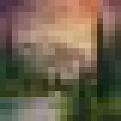
Figure 1. A Bob Ross-style painting, reduced to 20 x 20 pixels (then blown up to 250 x 250 pixels). View the original image.
After rescaling, I again used the ImageMagick software to convert the image files to .txt files, each with 400 rows – that’s one row per pixel – and three columns. The first two columns formed an ordered pair that gave the (x , y) coordinate of each pixel in the painting. The third column was the RGB color value, which recorded the red, green and blue color concentration for each pixel, each ranging in value from 0 to 255. I then split the RGB color column for each painting into three separate columns, one for each color.
Next, I turned each painting into a single vector of length 1,200: for each painting, there are three variables, one per color, for each of the 400 pixels, creating a total of 1,200 variables per painting. I then combined all of the paintings into a single data frame with 222 rows and 1201 columns, one of which was an ID variable used later for reference.
PCA: Painting clever analyses
Okay, so that’s not what PCA means. PCA actually stands for ‘principal component analysis’, and it’s used in a wide array of contexts, from statistics and machine learning to neuroscience. In this example, I used it as a method of dimension reduction. One thousand-plus variables are way too many for only a couple hundred observations, so I needed to reduce the number of variables significantly. I chose to use principle components as my dimension reduction method because it is widely used in image reconstruction.
But what does PCA actually do? Essentially, it takes the data in the dimension given and provides approximations to each data point in lower dimensional spaces. The first ‘principal component’ is the approximation to the data points in 1D: each observation of 1,200 values is turned into a single point on the number line. I ended up using all 222 principal components in my clustering analyses. That’s still a very large number, but it’s much smaller than 1,200. I then used these 222 principal components, each of length 222, as my variables for clustering the paintings.
Clustering
I examined three different methods of clustering: hierarchical clustering, model-based clustering, and k-means clustering. Each of these methods requires a distance metric: a way to measure the difference in or distance between observations. For consistency I used the same metric, Euclidean distance, for each method. I also looked at several different sizes of clusterings for each method, from 4 clusters up to 25 clusters.
Hierarchical clustering can link observations in several different ways. Agglomerative clustering, the method I investigated, takes a bottom-up approach by starting with each observation as its own cluster, then grouping the observations together step-by-step until they all form one giant cluster. There are several different ways of defining the grouping mechanism. I investigated the complete linkage or farthest neighbor clustering method because it is most likely to form groups of similar diameters with observations that are also very similar within clusters. It joins two groups when the maximum distance between two observations in two different clusters is smallest. This works well for my purpose because I want the clusters of paintings to be close to each other within each cluster and as far away as possible from the other clusters.
Model-based clustering assumes the data are from a Gaussian mixture model, meaning the clusters form ellipsoids of varying volumes, shapes, and orientations in the data space. In this case, that meant ellipsoids in 222 dimensions. The clustering that best fit the data resulted in four ellipsoids of equal volume and different shapes, oriented in the same direction as the coordinate axes.
Finally, I ran k-means clustering on the data. This type of clustering forms the best clustering of k groups of the observations around k centers, or means. I then examined all three methods and determined the best clustering from various measures applied to clusters – such as entropy, within cluster sum of squares, and maximum cluster diameter, as well as some visual inspections. In the end, I determined that k-means gave the best clustering of the 222 paintings.
K-means business
To determine the value of k, the number of groups of paintings I’d end up with, I looked at several cluster statistics comparing clusterings of size 4 up to size 25. Because the k-means algorithm picks different centers at random each time, I set a seed so that the different clusterings would be comparable. A plot of 11 of these cluster statistics is given in Figure 2.
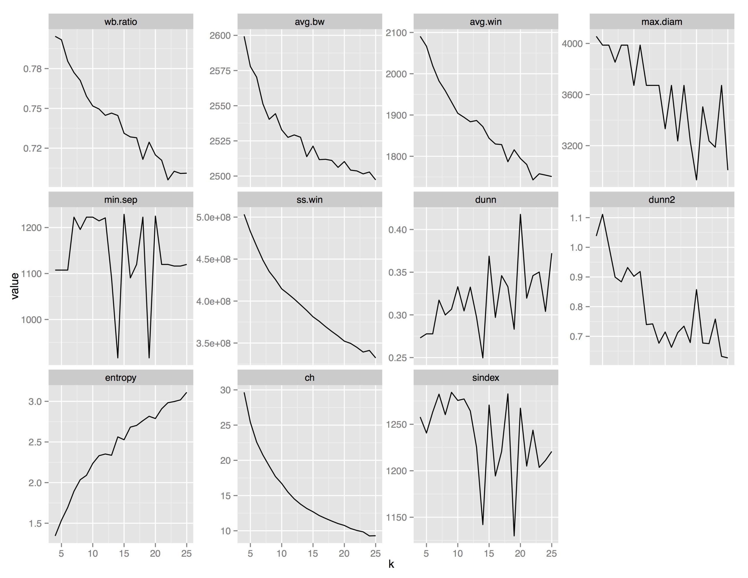
Figure 2. Clustering evaluation criterion for different sizes of k-means clustering from four to 25 clusters.
Some of the statistics, like min.sep – the minimum separation between any two points in different clusters – provided no clear clustering “winner”: the value of the statistic jumped up and down. Others, like wb.ratio – the ratio of the mean sum of squares within cluster to the mean sum of squares between clusters – suggested that more clusters are always better.
The Dunn criterion, which is a ratio of smallest distance between points from different clusters over maximum distance of points within a cluster, indicated that 20 clusters was best because it had the highest value of this ratio. K = 20 was also clearly supported by the maximum diameter and dunn2 criteria. In the former, it had the lowest value, meaning the maximum distance between any two points in the same cluster was smallest. The latter is a ratio of minimum average dissimilarity between two clusters to the maximum average dissimilarity within clusters. This value should be large, so the spike at k = 20 supported choosing 20 clusters. So, that’s what I did. The numbers of paintings in each of my 20 clusters were 6, 12, 8, 8, 16, 15, 4, 8, 17, 6, 6, 5, 6, 24, 10, 11, 8, 18, 19, and 15.
A literal average of paintings
Next, I looked at the original paintings in each cluster separately and gave each cluster a descriptive title. I also wanted to discover what an “average” painting in each of the 20 clusters looked like. I plotted the averages of all 20 clusters in Figure 3. To calculate these values, I combined all the .txt files for all the paintings into one data set, grouped them by cluster and pixel location, and computed the average red, green, and blue color values for each pixel in the 20 x 20 grid. I was very excited to see just how well the cluster titles matched the average paintings.
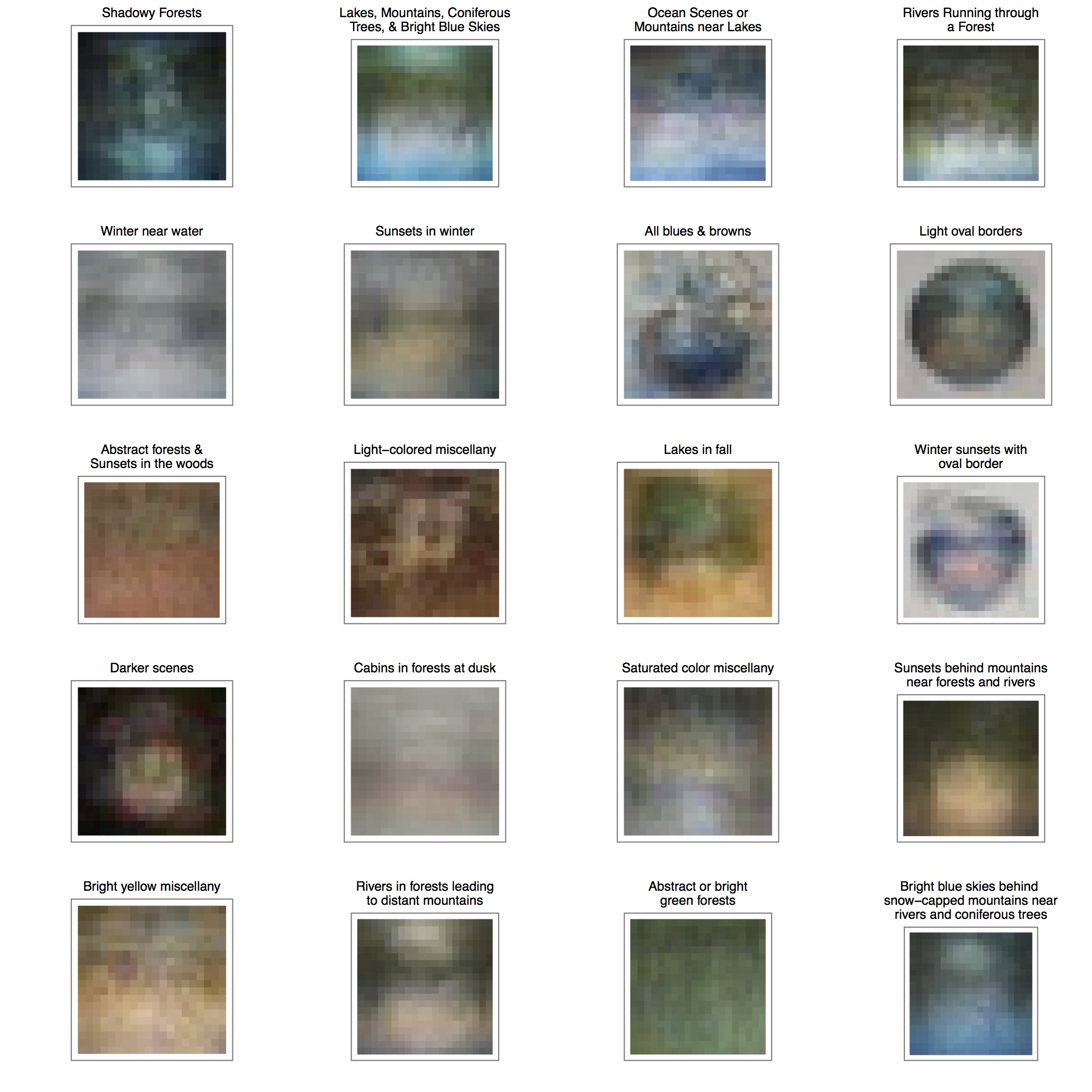
Figure 3. The average paintings of the 20 clusters. Compare with the descriptions in their titles.
We can really see that there are some distinct elements and themes throughout this collection of Bob Ross-style artwork. For example, the clusters titled “shadowy forests”, “light oval borders”, “winter sunsets with oval borders”, and “darker scenes” seem to match especially well with their respective average paintings. Even though they’re pretty blurry, you can still see features like the dark greens and blacks in the shadowy forests and the borders surrounding the paintings. In the “lakes, mountains, coniferous trees, and bright blue skies” cluster, you can see where the water in the lake meets the grass, and where the trees meet the sky. Remember that the computer is only looking at blurry originals, so the averages look pretty blurry, too.
Bob Ross clearly loved mountains and lakes, sunsets and forests, and every combination thereof – and so do his followers. He was a champion of art education, believeing that everyone could be an artist, and clearly many people were inspired to pick up a paint brush thanks to him. Some of us, however, just don’t have an artistic hand. But if you happen to have a statistical mindset, and some machine learning knowledge, you can still do some ‘painting with numbers’ to get a little bit of that Bob Ross style.
Editor’s note
Samantha Tyner was a finalist in the 2015 Young Statisticians Writing Competition, organised by Significance and the Young Statisticians Section of the Royal Statistical Society. Details of the 2016 Young Statisticians Writing Competition will be announced in February.


