
In this brief overview, we’ll see that there are some very interesting patterns in the forecast data that merit further study. For ease of exposition, we will build up the comparison stage by stage, starting with an eight-country comparison – which, as explained in Part 1, will be our main point of comparison. We also extend our analysis to include comparisons of forecasts made for countries outside the top eight, including those that predicted the full medal table.
An eight-country comparison
It is no exaggeration to say that the top of the 2016 medal table defied all expectations, with the USA and Great Britain picking up medals left, right and centre, and the Chinese and Australian teams consistently failing to produce the goods.
As shown in Table 1 below, all of the 14 medal forecasts reviewed in Part 1 ended up performing very poorly at the top of the table, when assessed across the eight “big hitter” countries (which as expected, were indeed the eight countries winning the most medals overall). To briefly explain the orange portion of the table, the values above the eight country names are the total number of medals won by each country, while the positive and negative numbers in the body of the table indicate the difference between each forecast and the actual number of medals won. For instance, Goldman Sachs predicted that China would take home 89 medals overall, which was 19 more than the 70 medals that China actually won – therefore, Goldman Sachs receives a “19” underneath CHN. The green portion of the table shows the mean absolute error and mean squared error for each forecast.

(A quick data note: When examining Cazeneuve’s forecasts in detail, we counted a total of 54 Great Britain medals across his predictions, rather than the 53 claimed in his overall summary table – we therefore decided give him the benefit of the doubt, and use the more favourable value of 54.)
As Table 1 demonstrates, when assessed over the eight “big hitters”, the numbers from OMP (Olympic Medals Predictions) came out as the best of the bunch, having both the smallest mean absolute error (7.375) and smallest mean squared error (88.375). However, objectively speaking, even the OMP forecast was relatively disappointing, with four of the eight predictions lying ten or more medals away from the true final tallies.
To put the size of this year’s discrepancies into context, it is worth noting that for the London 2012 Olympics, the WSJ’s widely-trumpeted predictions achieved a mean absolute error of 3.250 and a mean squared error of 14.750 on the equivalent eight “big hitters” calculation. This time around, the WSJ model placed eighth in the table, scoring 10.875 and 159.125 respectively on the two metrics.
(We note in passing that we have ordered each of our tables by mean absolute error, and taken this as our primary metric, since the mean squared error metric is disproportionately influenced by single large errors made by the forecasts – as can easily be seen by comparing the Forrest and AOC forecasts. This point will be revisited again later in the article.)
So, all in all, it’s fair to say that none of the forecasts issued ahead of the Games did a particularly good job of predicting the performance of the “big hitter” countries, since the high-quality elements of certain predictions – such as Cazeneuve’s impressive call of 118 for USA, Tuck’s spot-on 67 for Great Britain, and so on – were drowned out by the huge errors made by the same forecasts on other countries.
But what if we look further down the forecasts, beyond the top few finishers? When we step back and look at a larger portion of the medal table, we begin to observe some interesting patterns.
Turning the tables
In all, nine of our 14 forecasters provided predictions that were more extensive than just a top-10 list – sometimes a top-30, sometimes a top-50, and sometimes a complete set of predictions across all countries. How might we go about comparing these more comprehensive forecasts?
We started by drawing together the available data from the sources noted in Part 1:
- Top-30 forecast from Kuper (ordered by total golds)
- Top-30 forecast from PWC (ordered by total medals)
- Top-33 forecast from Tuck (ordered by total medals)
- Top-50 forecast from Goldman Sachs (ordered by total golds)
- Complete all-country forecasts from ATASS Sports, Cazeneuve, Gracenote, OMP, and WSJ (ordered by total medals)
- Actual “total medals” table from the 2016 Games (consolidated from two independent sources – BBC and Google)
Obtaining the full and accurate OMP and Cazeneuve forecasts from the relevant sites required some significant data processing – further details of this procedure are available on request. Note also that we do not have access to the full Bredtmann forecast showing how exactly the reallocation of Russian medals was handled, so we cannot (yet) include it in the comparison.
An 18-country comparison
As discussed in detail in Part 1, there are very good reasons to avoid picking our comparison set of countries based on the actual final medal table. Instead, we decided to start by taking the comparison set to be the countries featuring in the “top 25” of all nine forecasts (when the countries were ordered by total medals). This list is independent of the actual medals won, and effectively represents the top-25 consensus across the forecasts. This procedure produced a comparison set of 18 countries, and Table 2 below shows the results of comparing the nine forecasts across this set:
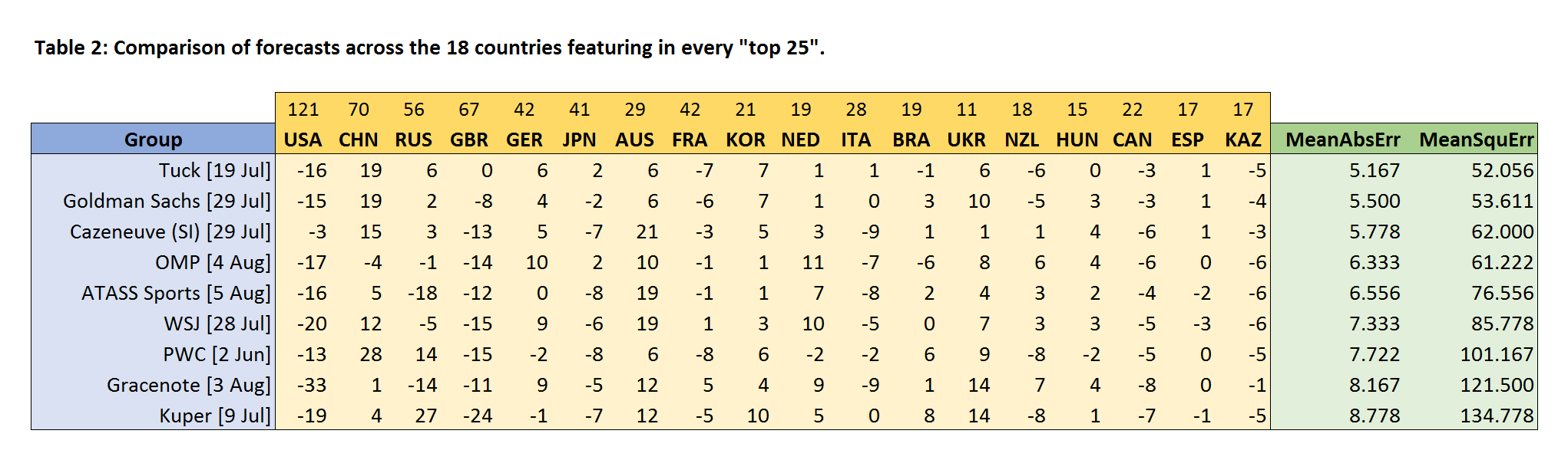
Broadly speaking, we see that the ordering is similar to that in Table 1, though OMP is doing less well on this more extensive comparison, and has now been overtaken by Tuck, Goldman Sachs, and Cazeneuve. Propping up the table, some way off the pace, are Gracenote and Kuper.
It’s notable that the values for the mean absolute error and mean squared error in Table 2 are all consistently smaller than those in Table 1, but this does not indicate that the predictions in Table 2 are better – it simply reflects the fact that the extra countries we have added receive fewer medals than the countries at the top, meaning that the forecast errors will generally be smaller.
A 33-country comparison
How might we extend the comparison list further? As the Tuck predictions appear to be performing well in Table 2, it’s natural to see what happens when we take our comparison set to simply be the 33 countries appearing in the Tuck list. This choice forces us to drop PWC and Kuper from the comparison (due to missing data), leaving seven eligible forecasts. The results of the comparison are shown in Table 3 below.

Once again, as more countries are included in the comparison, OMP continues to drop in the rankings. Cazeneuve and Tuck still occupy the top of the table, while the ATASS Sports forecast – based on a probabilistic assessment of all competitors – rises into third place on the mean absolute error metric. (We do not observe quite the same pattern in the mean squared error metric, but we will explain further below why the absolute error metric provides a more reasonable and meaningful comparison of the forecasts.)
A 50-country comparison
Before moving to the final comparison over all countries, we will quickly try expanding the comparison set a little further, and define it to be the 50 countries appearing in the Goldman Sachs list. This choice leads us to drop out Tuck (due to missing data), leaving six eligible forecasts. The results are shown in Table 4 below.
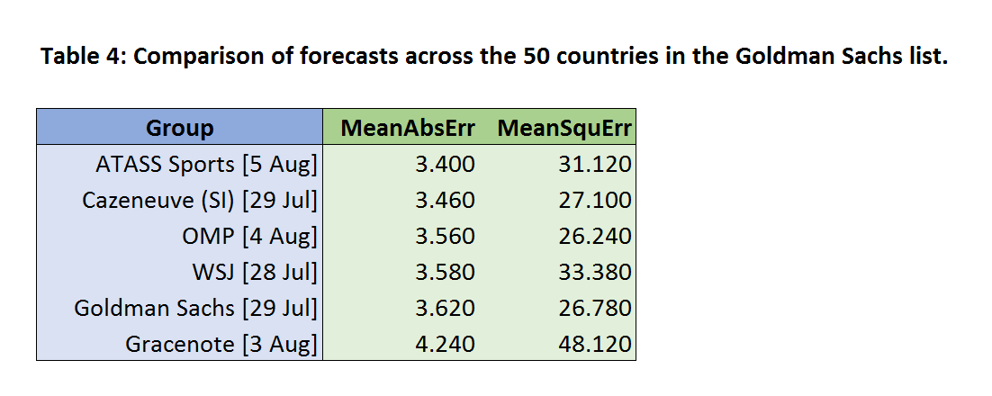
Assessed over this richer variety of countries, the ATASS Sports forecast now tops the chart on mean absolute error, just ahead of Cazeneuve, while the WSJ model is also improving, and close to surpassing OMP. Goldman Sachs performs poorly (in terms of mean absolute error), sliding down to second-to-bottom place ahead of Gracenote.
A 107-country comparison
Finally, we perform a full comparison of the five forecasts that provided medal predictions for all the competing countries – namely, ATASS Sports, Cazeneuve, Gracenote, OMP, and WSJ.
For this comparison, it makes sense to exclude countries with zeros across the board (i.e. countries that not only didn’t win a medal, but weren’t predicted to win a medal by any forecast), since such countries clearly cannot affect the comparison. We do, however, include countries that were predicted to win a medal by at least one forecast, even if in reality they did not win one.
Applying this filter gives us a final comparison set consisting of 107 countries. The green portion of Table 5 below shows the results of performing the forecast comparison on these 107 countries, with the grey portion of the table showing the value of the comparison metrics when restricted to the eight “big hitters” and the 99 other countries in the list. (Note that the “big hitters” values are precisely those that appeared earlier in Table 1, and that the best value in each column has been underlined.)

We see that on the mean absolute error metric, the ATASS Sports forecast tops the table when evaluated across all competing countries. The reason for this is evident from examining the numbers in the grey portion of the table: despite scoring a mid-table performance over the eight “big hitters”, this forecast does better than the rest on the “other 99 countries” comparison, both in terms of mean absolute error and mean squared error – with the WSJ forecast taking second place in both cases.
(It may be worth saying a few words on the decision to take the mean absolute error as our primary metric. In short, we do not regard the mean squared error to be a satisfactory way to compare forecasts over the whole medal table, as the value of this metric is very strongly determined by a forecast’s performance in the top portion of the table, where the medal counts are higher. For instance, under the mean squared error metric, being 16 medals away on one of the top teams carries a huge penalty of 256 – equivalent to being four medals away 16 times, or two medals away 64 times. In contrast, the mean absolute error provides a much more balanced assessment across the entirety of the table.)
Arguably, this final comparison table really gets to the heart of how the prediction methods differ from each other, and is perhaps the most thought-provoking finding to come out of this analysis. Our interpretation of the above results is that while a variety of methods can be used to generate reasonably similar predictions for the top of the table (since, as noted in Part 1, the gaps between many of the “big hitter” predictions are well within the bounds of random variation), the most reliable way to forecast the entirety of the medal table is through statistically modelling the probabilities for all competitors – the technique adopted by both ATASS Sports and the WSJ.
This idea makes intuitive sense, too. In many cases, the final medal tally achieved by a relatively weak country will be down to the accumulation of small fractional chances across multiple events. Such countries will end up winning a small number of medals even if they do not have a single top-3 competitor in any of the events they enter – which is why it is tricky for a “pick the medallists” strategy (as followed by Cazeneuve, OMP, and Gracenote) to perform well on these outsiders.
In conclusion, while none of this year’s forecasts could pull off a display worthy of Usain Bolt in the “top-eight dash”, when it came to the more extensive task of predicting the entire medal table, the Mo Farah in the pack turned out to be the probabilistic modelling approach propounded by ATASS Sports and the WSJ.
We will be continuing to investigate the patterns in the forecasts over the coming weeks and months, and would be delighted to hear from researchers who are performing their own analyses of the data.
- Dr Tim Paulden is innovation and development manager at ATASS Sports.


