Today, I would like to revisit the WSJ’s heat maps through the lens of a data visualisation practitioner. In particular, I would like to show how these heat maps can possibly be improved upon by reviewing some basic rules of data visualisation, and trying out some other methods for displaying the data. Below, I’m going to walk through four major criticisms and show how addressing them can possibly improve the original work.
For the curious, I’ve released my notebook with the Python code used to generate the new visualisations.
Categorical colour palettes should not be used to display continuous values
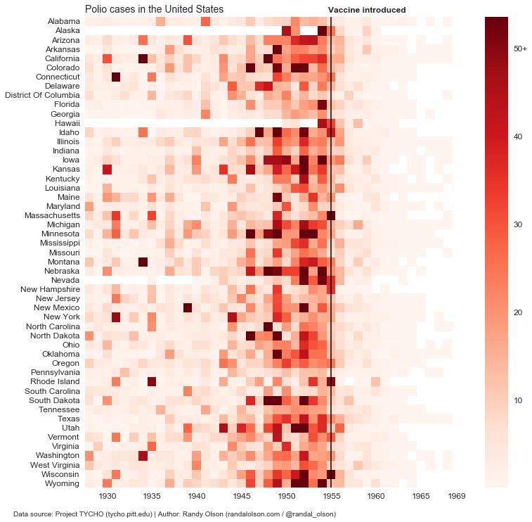
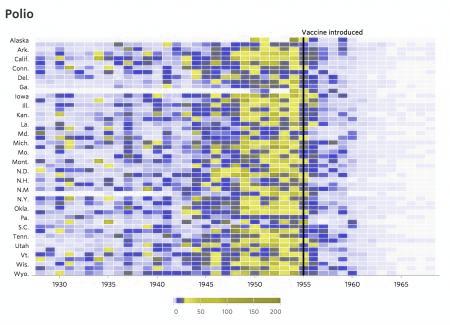
Perhaps one of the most straining issues with the original WSJ heat maps was their use of a custom categorical color palette to display the infection rates. The palette runs through most of the colours of the rainbow at seemingly-random intervals. It’s possible that they calculated the quantiles to determine the ranges for the colour bins (as they should!), but that wasn’t indicated in their methodology.
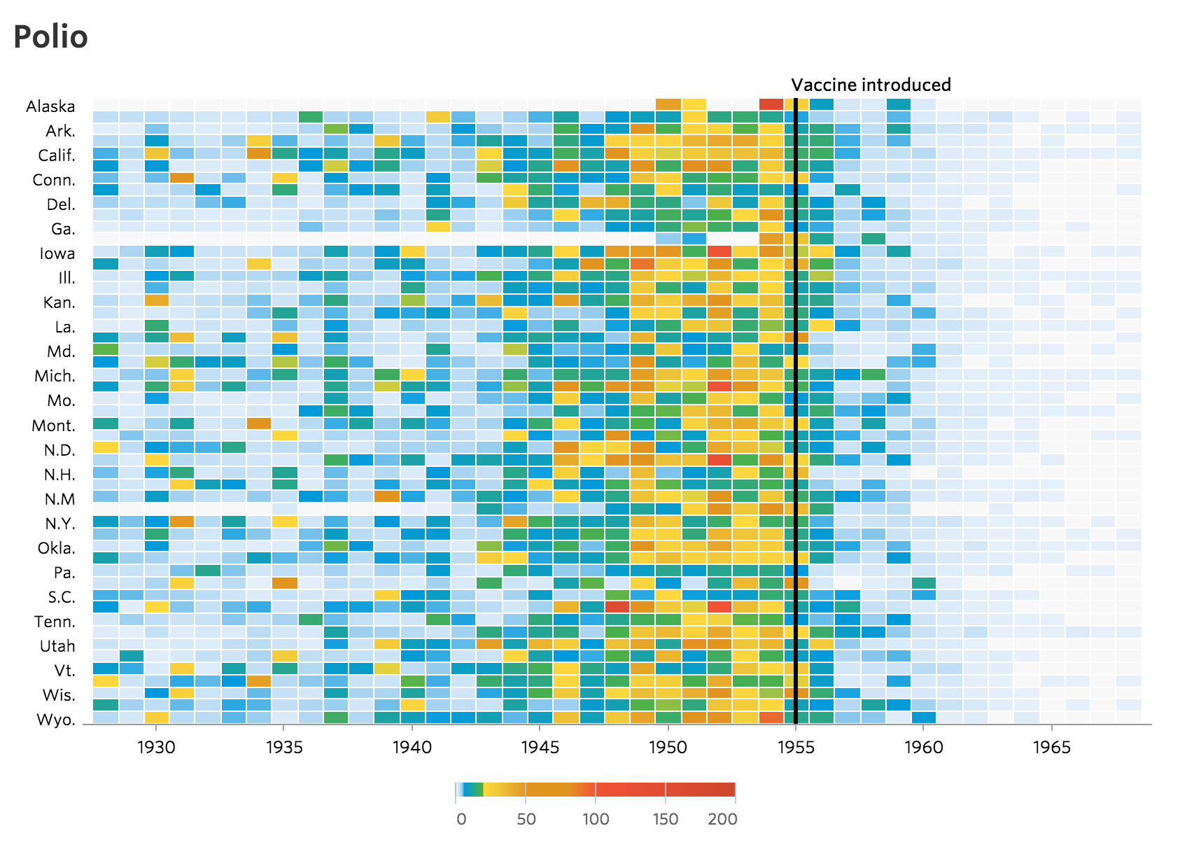
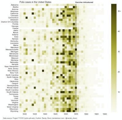
In any case, it’s rarely a good idea to use multiple colours to display a single continuous variable. Here, all we want to do is use colour to show the infection rates for each year. If we use more than one colour, our readers have to constantly refer back to the legend to figure out what each colour means, which is an unnecessary cognitive strain on our reader. Instead, we should use a single-colour sequential palette, where lighter shades indicate lower values and darker shades indicate higher values. I’ve reworked the Polio heat map to do just that below.
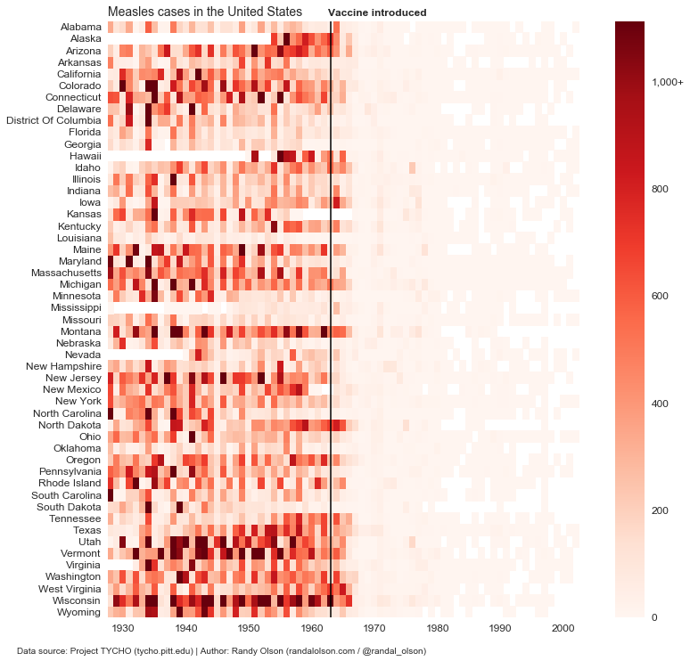
One exception to this “rule,” of course, is diverging colour palettes. If there is a clear divide in our continuous variable — for example, if we’re displaying gains and losses for a company — then it could be appropriate to use a diverging colour palette with one colour to represent gains (values >/= $0) and another to represent losses (values <$0). Just for fun, I recreated the same chart above for Measles so we can compare it to the originals on WSJ.
Multi-hue colour palettes should take colour blindness into account
Colour blindness is probably one of the most-overlooked issues in data visualization, and the WSJ heat maps are a great example. I ran the WSJ heat map above through a colour blindness simulator for red-green color blindness — the most common form of colour blindness — and below is the (low-resolution) result.
Disastrous! Much of the colour gradient is lost in some yellow/grey abyss, and the dark purple colors represent low values whereas the lighter yellow and dark grey colors represent higher values. This colour palette survives better than most and the main message is still (mostly) communicated, but the WSJ colour palette is certainly far from ideal here.
For comparison, I ran my rework from above through the same red-green colour blindness simulator. As we can see, the simple sequential colour palette is practically unaffected by this form of colour blindness. Problem solved!
The main lesson here is that we should always run our colour palette through a colour blindness simulator before committing to it. Roughly 5% of our audience will experience our data visualisations through that lens.
Colour can’t display specific values very well
One of the major drawbacks of heat maps is that they rely on colour to communicate the specific values in each cell. While it’s not always important to display a precise value, there can sometimes be important trends hiding in these small differences. For that reason, I reworked the Polio heat map into a simple line chart below, where each light line is a state and the dark line is the median value between all the states for each year.
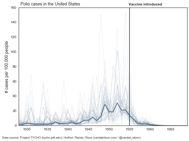
The above chart isn’t too useful, and the data is too messy to make much sense of the state-by-state trends. However, the decline in infection rates after the introduction of the vaccine is abundantly clear even in this case.
No post of mine is complete without small multiples, so let’s give that a try. Below, each state has its own chart, and all 50 states (+ D.C.) are put on the same time axis.
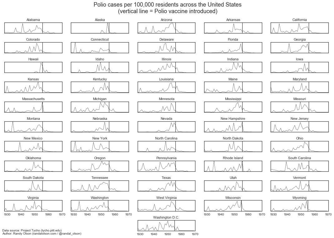
Each line tells its own story, and these are stories that were masked in the heat maps. Small multiples allow use to see specific state-by-state trends. For example, Polio outbreaks were already on the decline in South Dakota even before the introduction of the Polio vaccine. Meanwhile, Polio outbreaks were at their worst in New Hampshire just prior to the introduction of the Polio vaccine, which made short order of Polio immediately thereafter.
We should always ask ourselves when designing data visualisations: Do we care about the broader story, or the smaller stories? In this case we could go either way, but the direction we go depends on the story we want to tell.
Sometimes you can show too much data
Another fair criticism of all the data visualisations shown so far is that they show too much data. After all, the main message of the WSJ heat maps was simple: When introduced to human populations, vaccines work. There’s no need to show the state-by-state trends then; in fact, we may be overwhelming our reader by providing too much data that doesn’t get right to the point. For example, what happened with Polio in Utah, with the infection rate more than doubling after the introduction of the Polio vaccine? Or what about South Dakota, where Polio seems to have been mostly eliminated even before the vaccines were made available?
These outliers are distractions to the overall trend. We can overcome these distractions by applying a simple statistical analysis to the data, and show the overall trend with confidence bounds. Below, I’ve done just that by plotting the median Polio infection rate across all states (dark line) with bootstrapped 95% confidence intervals (shaded area).
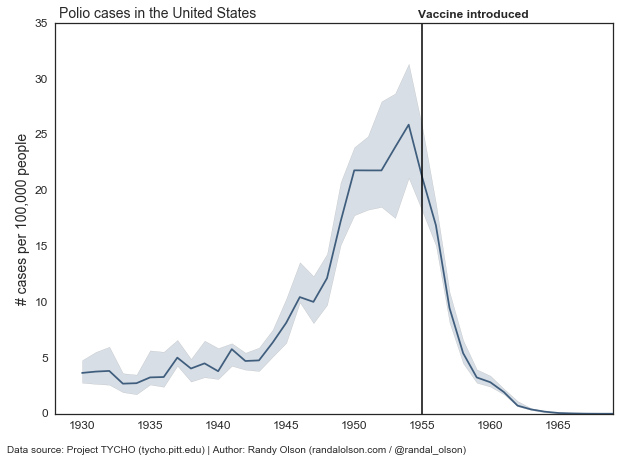
By summarizing the data with some basic statistics, we’ve removed the distractions and gotten straight to the point: Overall in the US, Polio outbreaks were on the rise from the 1940s onward. Right at the introduction of the Polio vaccine in 1955, we immediately saw a decline in Polio outbreaks until it was practically eliminated in the 1960s.
Again, we should always consider our story when designing data visualisations. If we have one clear story that we want to communicate, we should consider reducing the amount of data we show to the point that we can effectively — and honestly — communicate our story. There’s no point in confusing our reader with unnecessary details, unless those details contain an important caveat.
Conclusions
To wrap up, these are the lessons we’ve drawn from revisiting the popularised vaccine visualisations:
- Use sequential colour schemes when presenting continuous values;
- Consider colour blindness before committing to a colour scheme;
- When presenting specific values is important, don’t use colour to represent those values;
- Only show enough data to effectively and honestly tell your story.
- Randy Olson is a postdoctoral researcher at the University of Pennsylvania, where he studies biologically inspired artificial intelligence and its applications to biomedical problems. He blogs at randalolson.com/blog, and has recently developed an online course on data visualization in Python


