
Consider the following problem: “The serum test screens pregnant women for babies with Down’s syndrome. The test is a very good one, but not perfect. Roughly 1% of babies have Down’s syndrome. If the baby has Down’s syndrome, there is a 90% chance that the result will be positive. If the baby is unaffected, there is still a 1% chance that the result will be positive. A pregnant woman has been tested and the result is positive. What is the chance that her baby actually has Down’s syndrome?”
This question is taken, verbatim, from a paper by Ros Bramwell in the British Medical Journal. Only one obstetrician out of 21 that was asked this question got the right answer of ~48%; none of the 22 midwives that were asked did. Many of the wrong answers were around 90%.
Bramwell’s paper wasn’t the first to highlight problems people – including experts – have with understanding the results of screening tests. For example, when David M. Eddy asked physicians to calculate the probability a patient had breast cancer given they had had a positive mammography, he found that 95% of responses were incorrect. Instead of the correct answer in this (hypothetical) scenario of 7.8%, most answers were found close to 75%!
We can get the correct answers to the Down’s syndrome question above using Bayes’ theorem:
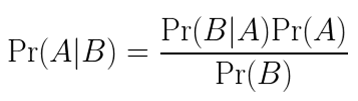
Using this nomenclature, Pr(A) is the probability of the patient’s baby having the condition being tested for and Pr(B) is the probability of the patient having a positive test. Then, Pr(B|A) is the probability of the patient having a positive test when the baby has Down’s syndrome and Pr(A|B) is the probability of the baby having the condition given that the patient had a positive test.
To calculate Pr(A|B) we can rewrite the denominator so that it better matches the information provided in the question.
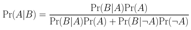
Here Pr(¬A) is the complement of A, i.e. the probability that the baby does not have Down’s syndrome. Plugging the numbers in from above we find:

![]()
The maths here is just a mix of multiplication, addition, subtraction and division, and the same formula can be used to answer the mammography question Eddy posed and in countless other screening-test scenarios. However, knowing the right equation to use and matching up the values provided with terms in the equation requires some thought, even to those who should be familiar with Bayes’ theorem.
Here’s the same problem, but this time using natural frequencies to convey the numbers:
“The serum test screens pregnant women for babies with Down’s syndrome. The test is a very good one, but not perfect. Roughly 100 babies out of 10 000 have Down’s syndrome. Of these 100 babies with Down’s syndrome, 90 will have a positive test result. Of the remaining 9900 unaffected babies, 99 will still have a positive test result. How many pregnant women who have a positive result to the test actually have a baby with Down’s syndrome?”
When this question was asked of obstetricians, Bramwell found they performed better: 13 out of 20 got the correct answer. However, 7 of the 20 obstetricians and all the midwives still got the wrong answer.
Why visualise?
The questions posed above include enough information for a casual reader to calculate the answer. Additional expert knowledge is not strictly required. And yet we have seen that those with experience of the fields in question still struggle with screening-test problems. Can we use visual encoding of information to improve clarity?
What follows is some ideas about how to visualise screening-test problems so that professionals in relevant fields and the public may be better able to understand them. The idea is to structure information and encode values in ways that mean the reader isn’t wholly reliant on verbal reasoning to pick out numbers from a “wall” of text and formulate appropriate equations.
Effective visualisation of information is a matter of science as well as art; research suggests that humans are better at completing certain visual tasks than others. For instance, we are very good at judging positions in one and two dimensions and are also good at judging lengths. We are less adept at comparing areas and volumes. We can distinguish one group of icons from another when they are different hues, but using colour saturation to encode magnitude should be avoided if we can use position or length instead.
None of the ideas presented below are truly original and I haven’t put them through specific experimental testing. In addition, context is always important: one solution may be better than another in a certain case but worse in others. You should always think about your audience and what information is essential to convey.
Visual solutions
Before looking at some solutions, it’s useful to introduce some common terminology related to screening tests:
- Prevalence: the proportion of the population being tested that are affected by a given condition;
- Sensitivity: The proportion of patients with the condition being screened for that are correctly identified as having the condition;
- Specificity: The proportion of patients without the condition being screened for that are correctly identified as not having the condition.
Using the definitions above and the numbers provided in the original question, we see that the Down’s syndrome test has a prevalence of 1%, a sensitivity of 90% and a specificity of 99%. We can use this information and a hypothetical pool of (say) 10,000 patients to visualise outcomes in the form of a simple decision tree.
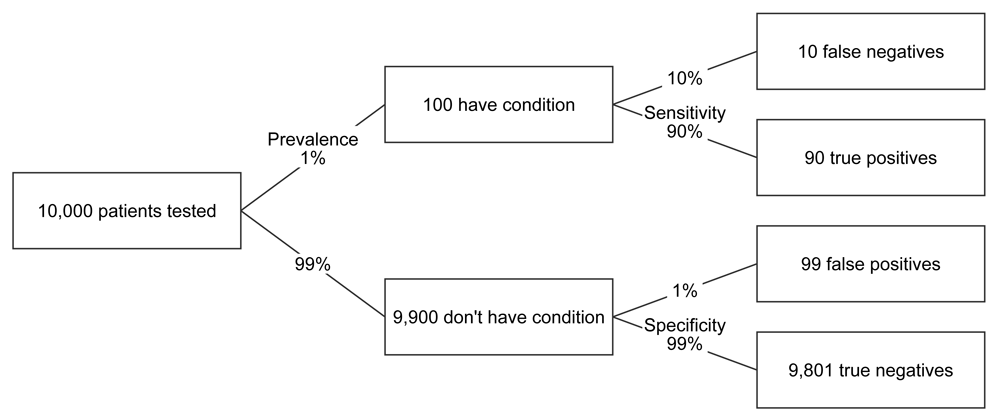
FIGURE 1 Decision tree for Down’s syndrome scenario
The decision tree lays out the information in a format that, I think, is much easier to follow than just a paragraph of prose. It also provides suitable labels to describe an outcome, namely true and false positives, and true and false negatives. However, the tree still relies heavily on verbal, rather than visual reasoning.
One way of providing more visual cues might be to partially fill the boxes in accordance with the relative number of patients at a given stage.
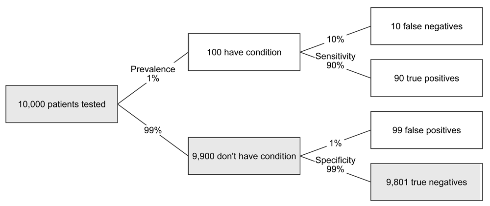
FIGURE 2 Decision tree, with partially filled boxes, for Down’s syndrome scenario
The problem here is that, while generally we are adept at judging lengths, in this specific case most of the lengths are too small to be visible. So, while the low prevalence of the condition is good for patient and baby, it makes it impractical to use length for visual encoding. For another screening test, especially if the condition being tested for has a much higher prevalence in the population being tested, this might not be the case. The chart below illustrates this for an entirely hypothetical scenario where a condition has a prevalence of 20% and the sensitivity and specificity are both 80%:

FIGURE 3 Decision tree, with partially filled boxes, for high prevelance scenario
Now we have what looks something like a set of four horizontal bars in the end column and we can see directly that true positives match false positives one to one by comparing the filled regions of the boxes. This comparison is helped by constructing the tree such that the true and false positives appear next to each other.
We don’t have to completely give up on the use of bars as visual aids for low prevalence scenarios, however. If we are primarily interested in positive tests, we can just look at those results on an appropriate scale. Here’s an example:
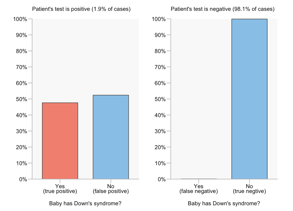
FIGURE 4 Seperated-bars chart for Down’s syndrome scenario
By separating out the positive and negative results we can compare true and false outcomes easily for each result. For example, we can see from the bar lengths or the ends of the bars that the number of true positives is slightly less than the number of false positives. However, we can no longer visually compare between test results. In terms of answering the question “What is the probability that a baby has Down’s syndrome given that the patient had a positive serum test?”, this isn’t a problem. However, it’s no longer obvious how these values are derived, as it is in a decision tree diagram. If we’re trying to help the reader understand why the false positive rate can match or dwarf the true positive rate, even when the sensitivity and specificity are high, then this visual format is of limited use.
I recently co-wrote an article with Jon Brock for Spectrum about screening tests for autism and how high numbers of false positive results (when compared to true positive results) can be problematic. We spent quite some time trying to work out how to encode screening information effectively. One of three formats we eventually picked was another variation on a bar chart. Specifically, it consisted of a pair of split bars. The top one is divided into four, indicating the four possible test outcomes, while the bottom one shows only the true and false positives. Let’s look first at this format for the high prevalence scenario (prevalence of 20%, sensitivity and specificity both 80%) seen earlier as a decision tree. FN, TP, FP and TN denote false negatives, true positives, false positives and true negatives, respectively.
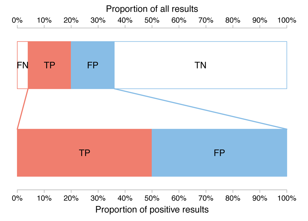
FIGURE 5 Split-bars chart for high prevelance scenario
From the top bar, we see that most results are true negatives, that the number of false negatives is relatively small but not negligible and that the number of true and false positives are roughly equal. From the lower bar, we see that the number of true and false positives are exactly equal (remember, this is a hypothetical example used for illustration purposes).
So how does this format fare when we go back to our Down’s syndrome test, where prevalence is much lower?
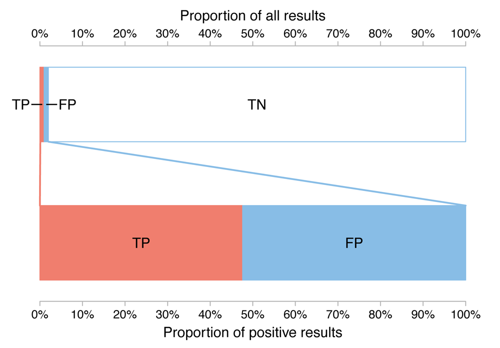
FIGURE 6 Split-bars chart for Down’s syndrome scenario
Clearly the labelling is less clean and the false negative cases can no longer be seen. However, we can see that true negatives are the predominant outcome and that true and false positives are similar in magnitude to each other. The latter was only available through verbal reasoning (i.e. reading the labels) in the decision tree while the former was hidden from view in the separated bar chart format. While comparing true and false positives is slightly harder than if the bars were aligned side by side with a common baseline, using the split-bars format the viewer need only look at the position along the bottom axis, where the true positive bar ends and the false positive bar begins, to estimate an answer to the question, “What is the probability that a baby has Down’s syndrome given that the patient had a positive serum test?”.
There’s a very different format for visualising screening test scenarios that I’ve seen on several occasions that is sometimes referred to as a unit chart. It uses icons or shapes to represent a sample of test patients while the subpopulation a patient belongs to is typically encoded by varying both the shape/icon and its colour. The collection of icons is usually best sorted (for easy comparison) but can be unsorted (to enhance the random sample metaphor). In the sorted case, considering the ordering can be important.
To illustrate this format, we’ll use the hypothetical high-prevalence scenario once more (the sensitivity and specificity of a test are 80%, while the prevalence of the conditions being tested for is 20% in the population of interest). In this example, we can see the large shapes created by the blocks of true and false positives match if we mentally rotate one or the other through 180 degrees. This might be less obvious if the icons were ordered differently.
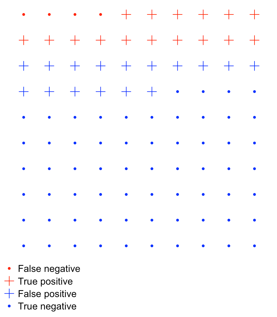
FIGURE 7 Unit chart for high prevelance scenario
True and false positives will not always be as easy to compare as they are in the example above and Stephen Few points out that unit charts have a severe limitation when it comes to quickly conveying information: “Because we cannot pre-attentively compare counts that exceed three of four objects at most, we’re forced to abandon rapid visual perception and rely on slower methods of discernment—counting or reading.”
Furthermore, when the prevalence of a disease is low, unit charts can become unwieldy because of the sheer number of icons needed to accurately represent the numbers. For example, with the Down’s syndrome data we can use 900 shapes in a 30 by 30 grid, but this still slightly overestimates the relative number of false negatives, while the true positive to false positive ratio is (roughly) 47:53, rather than 48:52.
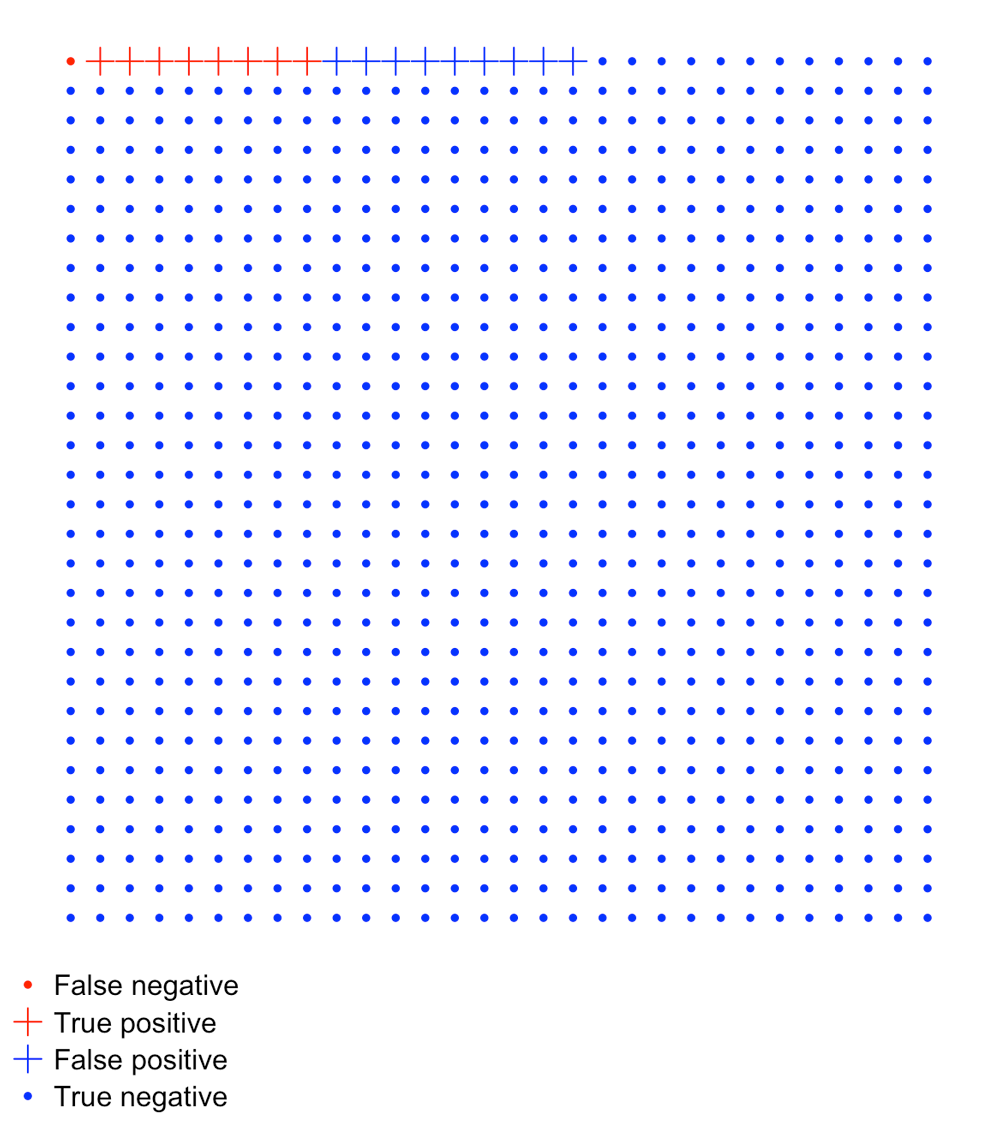
FIGURE 8 Unit chart for Down’s syndrome scenario
Conclusion
I doubt there is a one-size-fits-all solution to visualising screening-test problems, but having a range of visual metaphors shouldn’t be thought of as a hindrance. A decision tree may help one reader understand the problem while another might get more insight from a unit chart.
Formats also vary in terms of which comparisons are made easier. For some solutions, the rarity of an outcome can diminish the extent to which the format is useful. In that sense, the effectiveness of a solution can be data dependent.
About the author
Tim Brock is a freelance data analysis and visualisation consultant with a PhD in physics. His website can be found at datatodisplay.com
Further reading
- Sense about Science’s “Making sense of screening” is a 16-page guide that aims to help readers weight up “the benefits and harms of health screening programmes”. Areas covered include “What does screening actually tell you?” and “Why don’t we screen more people, more often, for more conditions?”. The latter section includes an important list, describing some of the negative effects of screening programmes. These include psychological harm and patients facing unnecessary procedures.
- One of the most significant papers to examine human graphical perception is probably “Graphical Perception: Theory, Experimentation, and Application to the Development of Graphical Methods” by William S. Cleveland and Robert McGill in the Journal of the American Statistical Association. It looks at “elementary perceptual tasks” and how accurate we are at performing them.
- David Colquhoun’s “An investigation of the false discovery rate and the misinterpretation of p-values” article for Royal Society Open Science looks first at “The screening problem” and uses tree diagrams as a means of displaying information.
- “How to Improve Bayesian Reasoning Without Instruction: Frequency Formats” is a paper in the Psychological Review by Gerd Gigerenzer and Ulrich Hoffrage. It compares probability and frequency formats for describing screening-test problems, using Eddy’s example discussed briefly near the start of this article.
- Luana Micallef uses a variation on the unit chart in her YouTube video that explains Eddy’s breast-cancer screening problem.
- arbital.com has a guide to Bayes’ rule. This includes cartoonish versions of unit charts and waterfall diagrams, which are similar to decision trees.


