
In an article in Economica in 1958, AWH Phillips suggested that there was a relationship between changes in wages and the level of unemployment — the lower the unemployment rate, the higher the rate of change of wages,¹ Since then, the Phillips curve has attracted a lot of theoretical analysis.²
Its main implication is that, since a particular level of unemployment in the economy will imply a particular rate of wage increase, the aims of low unemployment and a low rate of inflation may be inconsistent.
The government must then choose between the feasible combinations of unemployment and inflation, as shown by the estimated Phillips curve, for example 3% unemployment and no inflation, or 1½% unemployment and 8% inflation.
Alternatively, a government can attempt to bring about basic changes in the workings of the economy. For example, a prices and incomes policy, in order to reduce the rate of inflation in a way that is consistent with low unemployment.
Phillips’ methodology
Phillips plotted a scatter-plot of dispersed data points (x, y)
where x = the percentage unemployment rate
and y = the percentage change in wages
relating to the United Kingdom for the years 1861 to 1913.
He estimated y for each year by expressing the first central difference of the index for each year as a percentage of the index for the same year. So, he took the rate of change for 1861 as half the difference between the index for 1862 and the index for 1860, expressed as a percentage of the index for 1861, and similarly for other years.
He grouped the data points for those years in which percentage unemployment lay in unequal intervals on the x-axis from 0 to 2, 2 to 3, 3 to 4, 4 to 5, 5 to 7 and 7 to 11 percent ³
Since each interval includes years in which unemployment was increasing and years in which it was decreasing, Phillips reasoned that averaging would cancel out the effects of changes in unemployment on the rate of change in wage rates.
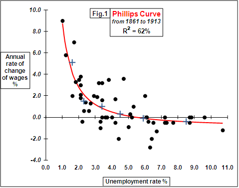
He calculated the average y value for each of those intervals and so derived 6 points (shown as blue crosses above). He then fitted a power curve to these 6 points.
The resulting model was
y+0•900 = 9•638x–1•394 (shown as a red line above) with R² = 62%
or log(y+0•900) = 0•984 –1•394log(x)
Phillips estimated the constants 9•638 and –1•394 by least squares using the averages in the first four intervals. He chose the constant 0•900 by trial and error to make the curve pass as close as possible to the averages in the last two intervals.
He then plotted data from 1913 to 1948. The data fitted the above model well. Lastly, he plotted data from 1948 to 1957. The fit was not good, but when the unemployment rate was lagged by 7 months, the data then fitted the original model well.
The flaw with Phillips’ model is that historically, the relationship between unemployment and inflation has not been sufficiently stable to permit exact judgments.
Another viewpoint
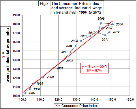
The graph below shows the data of the annual average industrial wage versus the annual Consumer Price index in Ireland from 1996 to 2012. As you can see, the increase in wages has roughly followed the rate of inflation in the recent years of the Irish economy.