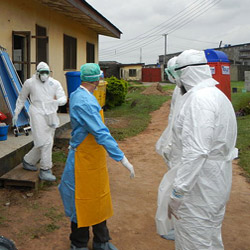

So while the media stress about travel bans and quarantine restrictions. I took a focused look at the progression of Ebola in the three West African countries at its epicentre. Guinea to the north, Liberia to the south and sandwiched in between to the west is Sierra Leone.
Given the location of the respective populations, we might expect the cumulative cases and death statistics in Sierra Leone to be a blend of those for the other countries. These small countries are closely interconnected and there appear to be concentrations of the outbreak around the border areas of all three nations.
However due to inexplicable reporting biases within each country for cases versus follow-up deaths, and the infrastructure proximity – at the connection of Guinea and Liberia – we see that these two countries instead are most similar at present.
The statistical visualization below shows the progress of all Ebola cases (horizontal axis) and deaths (vertical axis). The time series begins on August 29 on the lower left of the chart, and all the cumulative statistics then progress in the upper right direction, terminating on October 31. Given the unique and time-varying reporting frequencies, each countries data was manually aligned into the same semi-weekly format. The chart also uses logarithmic axis scaling to better contrast the three country's data (e.g. Liberia has a couple times the size of outbreak versus Guinea.)
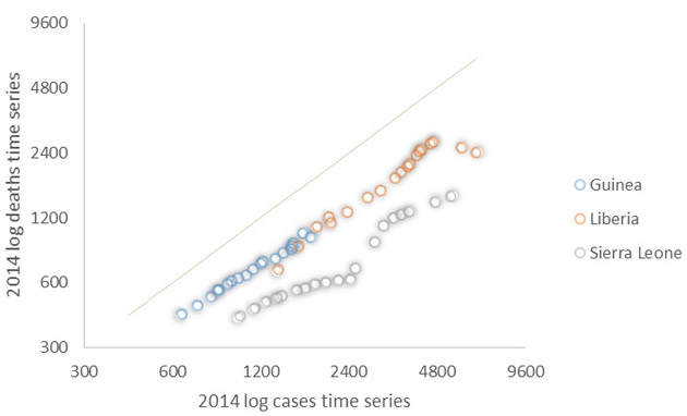
What immediately stands out from the painful statistics, are three things about the situation in Sierra Leone. The first is that the Ebola cases there have grown at a much faster rate. Secondly, at the same time Sierra Leone has had a lower reported death rate versus those in the other two countries. This has mostly been attributed reporting biases as it's a manual effort after all to follow-up on cases.
Thirdly, in Sierra Leone, the outbreak has only picked up in the past month (this can be seen as a convergence with the 1:1 green line). This could well be down to a retrospective analysis of hospital records that took place in early October.
The graph above makes it clear that the epidemic is far from over and efforts to eradicate it will have to settle in for the long haul. As Mario and Francis have shown elsewhere on these pages, promised funding has to be delivered to where it is needed. However, one aspect this funding has to be directed into is the proper statistical tracking of the epidemic.


