
In theory, analysing the performance of a source is simple: convert the prediction to a set of decimal numbers adding to 1, compare that to the similarly-converted final results using a metric. Repeat for all the sources and voila: the article should write itself. But the devil is in the details: which sources, and which metric to use? Below we give brief overview of the various sources, the 2010 election result, and the results of the comparison and analysis.
Opinion polls take samples from a population of individuals and ask variations on the question 'If there were a general election tomorrow, which party would you vote for?'. The raw responses may then be weighted by factors such as probability to vote, recall of previous voting, age and gender, and the results published as the percentage of votes that each party will get.
Exit polls are polls taken of voters immediately after voting. Results aren’t announced until after ballot boxes close, however.
Betting odds are odds on an outcome given by a betting firm: number of seats, total vote, most seats, most votes, and other combinations and formats. A given odds can be converted to an implied probability: e.g. 99/1 = 1/(1+99) = 1/100 = 0.01. But note that implied probability is not the same as actual probability. The implied probabilities for the 'full book' (the odds offered by a bookie on all outcomes of a given event) will not add up to 1, it will exceed it. This excess or 'overround' represents the bookie’s profit margin: if the probabilities add up to 120% then the bookie will only have to pay out 100/120 of the money betted. The size of the overround differs from bet to bet and from bookie to bookie. So if you don’t know the full book, you can calculate the implied probability but not the actual probability.
Betting spreads may be quoted as one number or the difference between two numbers: if the latter, then it is analogous to the bid-offer spread, where one sells a quantity at the lower number (or buys at the higher) in the hope of a later change. Spreads are offered on the seats taken by political parties. For this analysis, we will assume the betting spreads covered the entirety of the UK and the seat total was the full 650 in the House of Commons, including the 18 seats in Northern Ireland.
Campaign spending at UK General Elections is regulated and limited. Limits differ between the long campaign – the period after Parliament has sat for 55 months – and the short campaign – the period between the dissolution of Parliament and polling day. The two periods do not overlap. Campaign spending falls into three categories: party, non-party and candidate spending. The Electoral Commission records this expenditure for later publication but submission deadlines are after the election. Because of this, the utility of campaign spending to predict an election is limited.
Finally, we turn to academics and other people with websites who build predictive models or publish predictions and attempt to turn voting intentions into seat projections. This is easier said than done. The UK uses First Past The Post (FPTP) to assign winners to constituencies, and the number of seats won across the UK under FPTP is not proportional to the number of votes obtained (indeed, it is perfectly possible to poll most votes but not get most seats). Therefore it is not straightforward to derive seat predictions from vote predictions. Methods of doing this involve 'swing': the change (usually arithmetic, occasionally proportional) in voting intentions since the last election. A Uniform National Swing would then apply the arithmetic change uniformly across all UK seats and calculate the seat changes that implies. Some predictors use Uniform National Swing to translate votes into seats, others consider different areas separately and/or different versions of 'swing'.
Measuring performance
The official final results, in terms of seats won, for the May 2010 UK General Election are given in Figure 1. Though the Conservatives (Con) were the largest single party they did not have a majority and so entered into coalition with the Liberal Democrat (LD) party.
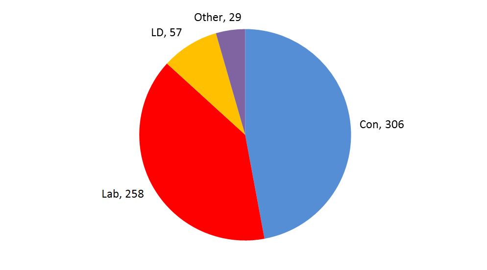
Figure 1: Final results. For the details, see Appendix 10. Number of seats total to 650
But how did the pollsters, pundits and predictors do in forecasting this result? To answer this question, we will consider each prediction as a set of points that can be paired to the result, and measure the difference between the paired points. We used the metric ‘mean absolute error’ (MAE) to grade and rank the performance of our sources. Full details on this and other aspects of the analysis can be found in the appendices (PDF download).
The best seat predictor was the exit polls. The modellers and the spread bookies were about the same. The minimum MAE was 0.003, the maximum 0.042.
{mbox:/significance/2015/graphs/Hill-Figure-2.JPG|width=630|height=305|caption=Click to enlarge|title=Figure 2: MAE of seat predictors. For the details, see Appendix 15. Note that UNS = uniform national swing.}
The best vote predictor was the pollsters, who were consistently better than campaign spending. Spread bookies were about the same. The minimum MAE was 0.013, the maximum 0.085.
{mbox:/significance/2015/graphs/Hill-Figure-3.JPG|width=630|height=304|caption=Click to enlarge|title=Figure 3: MAE of vote predictors. For the details, see Appendix 15. Note that SED = survey end date.}
The probability predictions were much the same, with no real difference between implied and actual probability. The minimum MAE when measured against probabilities was 0.206, the maximum 0.227.
{mbox:/significance/2015/graphs/Hill-Figure-4.JPG|width=630|height=309|caption=Click to enlarge|title=Figure 4: MAE of probability predictors against actual post-facto probability. For details, see Appendix 15. Note that actual result probabilities were Con 0, Lab 0, LD 0, No Overall Majority 1.}
Interestingly, if we compare them to the final vote tally and match ‘No Overall Majority’ to ‘Other’ we see that the performance deteriorates:
{mbox:/significance/2015/graphs/Hill-Figure-5.JPG|width=630|height=308|caption=Click to enlarge|title=Figure 5: MAE of probability predictors against actual votes. For details, see Appendix 15. Note that actual result shares were Con 0.361, Lab 0.29, LD 0.23, Other 0.119.}
The best and worst
Picking out the best and worst for each category we see the following:
{mbox:/significance/2015/graphs/Hill-Figure-6.JPG|width=630|height=306|caption=Click to enlarge|title=Figure 6: MAE of best and worst within class. For the details, see Appendix 16.}
So what can we conclude from all this? Firstly, that exit polls are the best predictor overall. This is perhaps not surprising: we should expect them to be, as they are asking voters who they voted for immediately after voting. However, views of exit polls in the United Kingdom are coloured by their prediction of a hung Parliament in 1992 (in the event, the Conservatives gained a narrow majority). Nevertheless they performed well in 2005 and, as we have seen, they were the best predictors in 2010.
In second place were pollsters, UK modellers, and spread bookies. They performed about the same in predicting seats: although compared to UK modellers, the spread bookies have a narrower variance and pollsters a wider one. The US modellers performed poorly, perhaps because the plethora of political parties in the UK makes forecasting that bit more difficult.
In third place was the money. Campaign spending is not as good a predictor as pollsters, UK modellers and spread bookies, but it wasn’t that bad. Candidate spending is much better than party spending and is not far worse than the worst modellers.
Bringing up the rear were the probabilistic predictions. Counter-intuitively, probabilistic predictions derived from betting odds are the worst of all predictors. There are reasons for this: the obvious one is that the overround introduces a bias. But even compensating for the overround by using it to translate the odds from implied to actual probabilities makes little difference (indeed, on this occasion it made it slightly worse). A more subtle reason may be the phenomenon called 'favourite longshot bias': favourites are systemically overvalued, longshots undervalued, and bookmakers do not assign zero or infinite odds to certainties and impossibilities.
The 2015 vote
This article covers the performance of known predictors at a single point against a known outcome at a single point, the 2010 election. In doing so, it ignores how those predictors vary over time. Knowing the outcome of the election at 10pm on election day is one thing, but what about a month beforehand? Three months? At what point do the predictors become useful? The follow-up to this article, scheduled for the June print edition of Significance, will compile the predictors as they have changed since 2010 and compare them to the final result on May 7 2015. There is still much to play for: exit polls may mess up, a pollster may be wildly out, punters will win or lose as the odds fluctuate. The game’s afoot…
- A version of this article with inline citations and appendices is available as a PDF download.


