

I read and watched with interest the Beveridge Lecture given by Professor Danny Dorling at the Royal Statistical Society in 2012.1,2 I was particularly interested in his comments on “the 9%” of the income distribution as an alternative statistic to the Gini coefficient. The best-off 10% of people minus the best-off 1% can be thought of as “the 9%” just below the best-off 1%.1
The Gini coefficient3 is often used to summarise income inequalities. It is confusing because it has no parallel in real life. The ratio of the area under the Lorenz curve to the area of a triangle is not a very intuitive concept.1 Changes in the Gini coefficient are difficult to interpret over time. Assessing the significance of such changes is a rather abstract process.
The percentage share of income of “the 9%” is easier to understand. It is a good proxy statistic for the Gini coefficient.
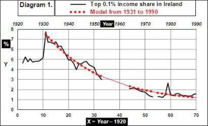
The time-series4 for the share of income by the top 0.1% of taxpayers in Ireland began in 1922 and ended in 1990, with a discontinuity of ten years from 1954 to 1963 and a missing value for 1974.
The decay model y = 0.67 + 11.09exp(–0.0435x) … … … (1) fits the available data from 1931 to 1990 with R2 = 97%. (See Diagram 1.)
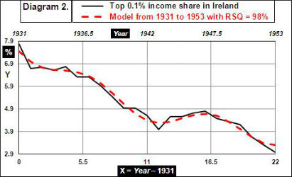
A wave model can be fitted to the subset of the above data from1931 to 1953 by incorporating a sine function. The model (shown in Diagram 2) then is
y = 3.15 + 4.76exp(–0.093x) + 0.48[sin{2π(x–3.40)÷10.46}] + ε … … … (2)
which has R2 = 98%.
Further econometric analysis follows of the pattern in “the 9%” share of the overall income distribution in Ireland over the 35 years from 1975 to 20095. It shows how the share of incomes near the top is at a minimum every 12½ years.
The Celtic Tiger5 years between 1995 and 2008 were a period of rapid economic growth. Recession then set in.
Time series wave-models can be fitted to the data6 for the top 10% and the top 1% of earners.
(See footnote on the methodology.)
The model for the top 10% (shown in Diagram 3) is
y = 29.29 + 0.20x – 1.45[sin{2π(x+0.66)÷12.27}] + ε which has R2 = 91%. … … … (3)

The model for the top 1% (shown in Diagram 4) is
y = 4.87 + 0.17x + 0.92[sin{2π(x+3.12)÷25.86}] + ε which has R2 = 94%. … … … (4)

Subtract the r.h.s. of model (4) from the r.h.s. of model (3) to get
y = 24.41 + 0.03x – 1.45[sin{2π(x+0.66)÷12.27}] – 0.92[sin{2π(x+3.12)÷25.86}] + ε … … (5)
which has R2 = 79%.
The following improvement on model (5) yields a better fit to the data for “the 9%”:
y = 24.45 + 0.02x – 1.37[sin{2π(x+0.56)÷12.44}] – 1.11[sin{2π(x+7.57)÷35.36}] + ε … … (6)
which has R2 = 92%.
Diagram 5 shows how the share of all earnings for “the 9%” oscillates to a local minimum every 12½ years.

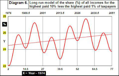
Diagram 6 shows Model (6) in the long run (assuming that the patterns since 1974 continue).
Data: See the Excel spreadsheet of calculations here.
Footnote on the methodology: The wave models of the time series from 1975 to 2009 are of the form y = A + Bx + C[sin{2π(x–D)÷E}] + ε where x = Year – 1974; y = income share (%); D = horizontal displacement from the y-axis; E = periodicity; and ε = residual error.
The parameters A, B, and C were estimated by the matrix formula for multiple regression coefficients.
Initial guesses (based on judgment of the periodicity by eye) were assigned to the parameters D and E, which were then adjusted by linear programming (using Excel Solver) to minimise further the sum of squares of the residual errors.
Changes in D and E automatically changed the values of A, B, and C in the regression formula.
References
-
Fairness and the changing fortunes of people in Britain 1970-2012 by Danny Dorling
(The Royal Statistical Society's 2012 Beveridge Lecture)
http://www.sasi.group.shef.ac.uk/publications/2013/dorling_jroyalstatsoc_176_1.pdf.
See also: The No-Nonsense Guide to Equality by Danny Dorling (1998), ISBN 978-1-78026-071-6, published by New Internationalist. - http://www.youtube.com/watch?v=-wplYhygkiU
- Gini coefficient: http://en.wikipedia.org/wiki/Gini_coefficient
-
Alvaredo Facundo, Anthony B. Atkinson, Thomas Piketty and Emmanuel Saez
The World Top Incomes Database http://topincomes.g-mond.parisschoolofeconomics.eu/ (accessed 28/01/2013) - The Celtic Tiger: http://en.wikipedia.org/wiki/Celtic_Tiger
- Long-Term Trends in Top Income Shares in Ireland, Nolan, Brian, 2007, in Top Incomes over the Twentieth Century: A Contrast between Continental European and English-Speaking Countries, ed. Anthony B. Atkinson and Thomas Piketty, 501–30, Oxford University Press.


