
Figure 1 shows the results for the New England Journal of Medicine, which are essentially identical to those from the Journal of the American Medical Association and all of the other journals I looked at.
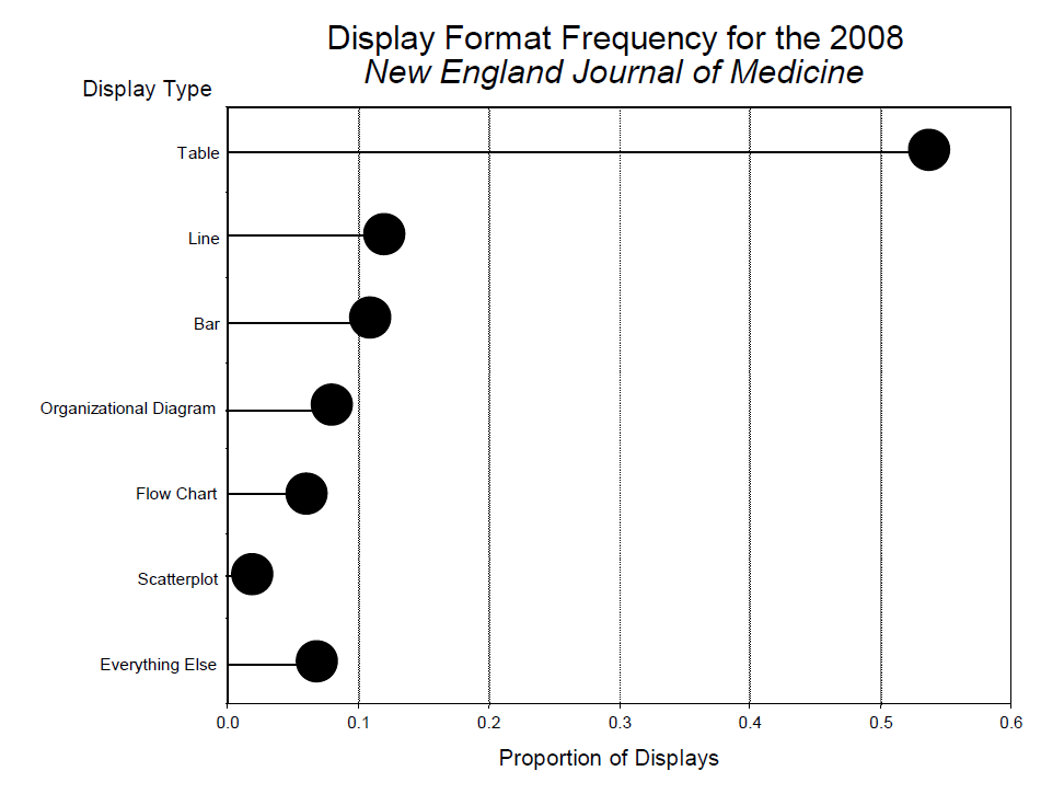
Figure 1. Display format frequency for the 2008 New England Journal of Medicine.
Why are tables so dominant despite their many obvious shortcomings? There are at least four reasons:
- Tables are easy to prepare – all you need is Excel.
- For extracting specific details, tables are superb.
- Historically tables were used for data archiving.
- Tables look more serious than graphs.
All of these are anachronistic now, so why does their use persist? Perhaps, paraphrasing Einstein, “Old display methods never die, just the people who use them”. Thus I felt it would likely not make much of an impact on medical researchers’ display methods by railing against tabular display (I have done that previously to no obvious effect (Wainer, 20163; 20144; 20091; 20055; 20006)). At this point I remembered a 1958 conversation between the renowned conductor Pierre Monteux, then rich in years and reputation, and a young conductor in one of his master classes at Tanglewood.7 The student told him that he was desperately seeking "the ineffable essence of Mozart". Monteux congratulated him on his high aim, and then said that it would do him no harm, meanwhile, to "learn how to keep the beat".
In that spirit, let us examine how we can make better tables – for while medical researchers are deeply involved in their search for truth, it seems to me that it would do no harm, in the meantime, to make them good ones – to get the beat right.
Three rules, one example
There are three simple rules that almost guarantee the easing of comprehension problems that usually accompany tabular presentation. They all grow from an orientating attitude:
A table is for communication, not data storage.
Modern data storage is accomplished electronically.
Paper and print are meant for human eyes and human minds.
The example
A standard data table of infection rates by state, abstracted from CDC's Morbidity and Mortality Weekly Report (September 19, 2014).
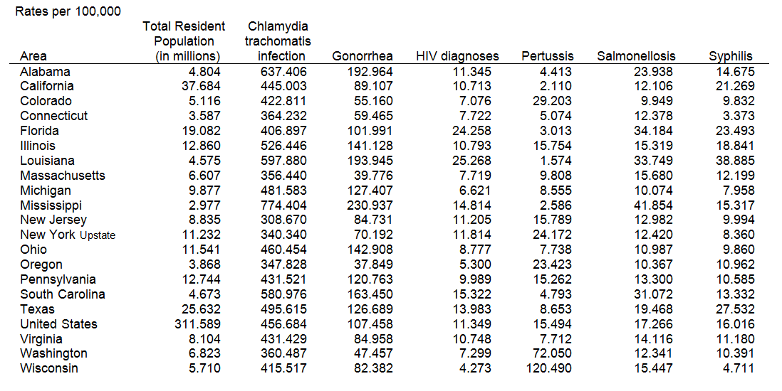
Table 1. Summary of Notifiable Diseases – United States, 2012
What kinds of questions are these data meant to answer?
- How often does each of these diseases occur?
- Which states have the highest infection rates? The lowest? Why?
- What sorts of infectious diseases are the most frequent? The least frequent?
- Are there any unusual data points? Which ones?
These illustrate the basic questions that we have of any table:
- What is the structure among the row variables (row effects)?
- What is the structure among the column variables (column effects)?
- What are the overall levels (grand mean)?
- Are there any unusual points (interaction effects)?
When we add multiple tables (in this case, perhaps, the same information for multiple years) we increase the questions substantially with the layer structure. How can we facilitate answering these questions?
The three rules
-
'All' is different and is important.
Calculate row and column summaries if they are not already there. Separate summaries from the rest spatially and perceptually. -
Order the rows and columns in a way that makes sense.
We are almost never interested in 'Alabama first'. Two often-useful ways to order are:
(a) Size – put the largest first. Usually we look most carefully at what is on top and less carefully further down.
(b) Naturally – time is ordered from the past to the future; showing data in that order melds well with what the reader might expect, which is always a good idea. -
Round – a lot.
This is for three reasons:
(a) Humans cannot comprehend more than two digits very easily.
(b) We can only rarely justify more than two digits of accuracy statistically.
(c) We almost never care about accuracy of more than two digits.
Calculating and showing 'all'
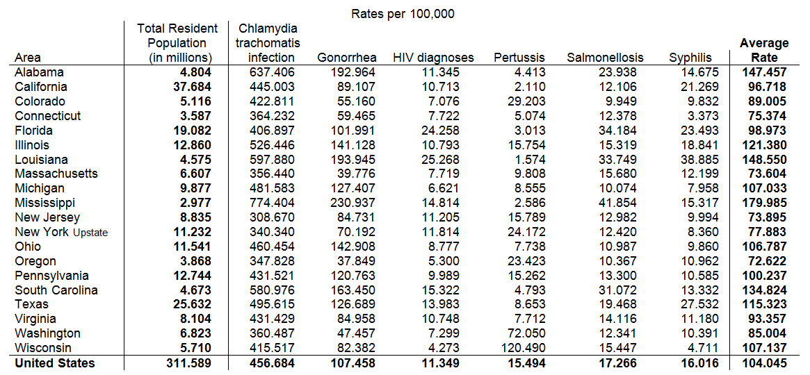
Table 2. 'All' is different. Calculate it, show it, and isolate it
Table 1 already has the figures for the entire United States, so all we need to do is move it to the bottom, and print it in bold to indicate its specialness. We also calculate the average rate of these infections for each state and append this to the right end of the table. Last, we indicate that the column showing population size is different from infection rates and, though important, should be isolated from those rates.
Order the rows and columns of the tables by the infection rates
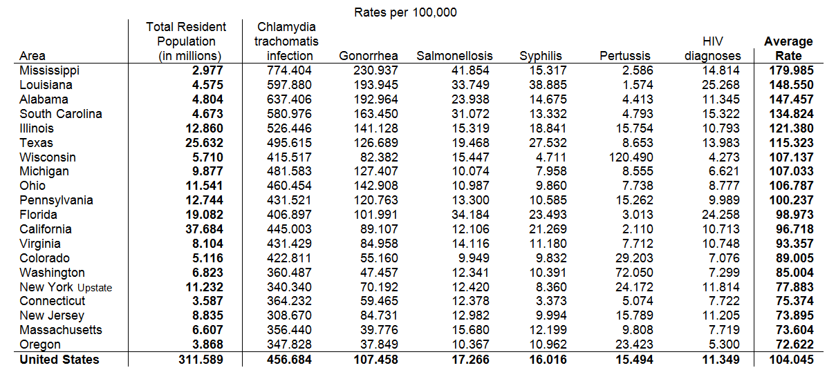
Table 3. We're rarely interested in 'Alabama first'. Order the rows and columns by the data
In this case, the existing alphabetical order is of little use except to help us find any particular state, but in a small table this is too minor an advantage to overcome its disadvantages. So instead let us order the rows by the average infection rate in a state (from high to low) and the columns by the frequency of occurrence of each type of infection from the most common (Chlamydia) to the least (HIV).
Now that we have reordered the rows of the table by the overall infection rate we note immediately that Mississippi and the rest of the Old South have the highest rates; Oregon and Massachusetts the lowest. The ordering of the columns tells us that Chlamydia and Gonorrhea have the highest rates of infection; Pertussis and HIV the lowest.
Rounding
Some might complain that profound rounding loses valuable information. Not likely. Note that in 2015 Walmart’s corporate revenue was $485,653,257,781. If we massively round it to $486 billion the resulting error is less than 0.1%.
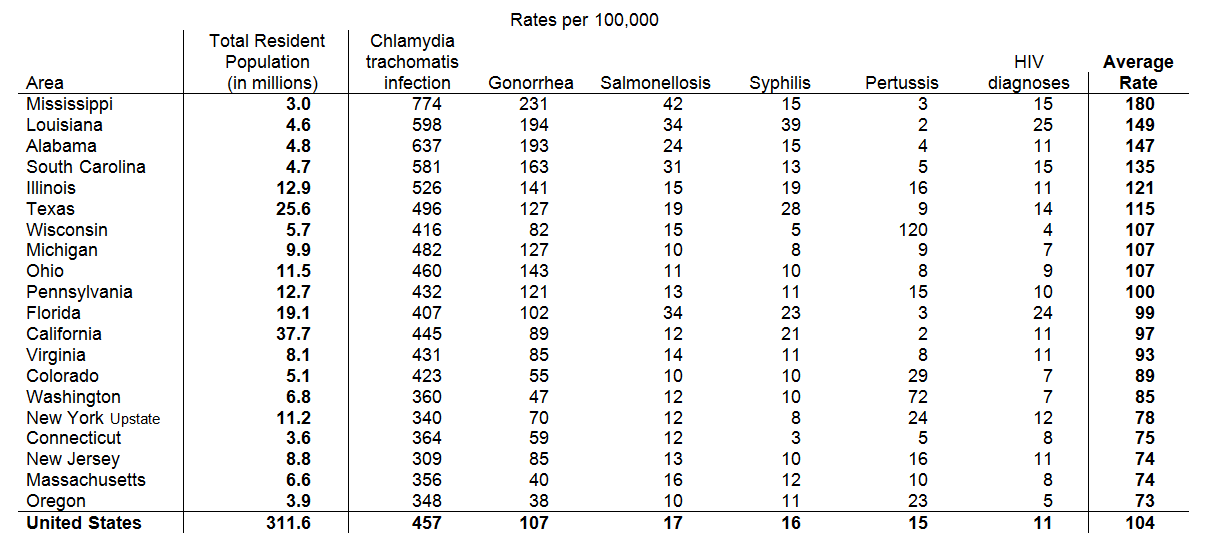
Table 4. Round – a lot
The rounding, by clearing away visual noise, makes it clear how unusual the Pertussis rate is in Wisconsin as well as the high rates of sexually transmitted diseases in the South. This insight is aided by comparison to the national figures at the bottom. We see that Mississippi’s Chlamydia rate is 50% higher than the national rate, Gonorrhea is more than twice the national rate, and Mississippi’s rates for Syphilis and HIV are at or above average.
Are these three rules enough? Or can we make further improvements?
Jacques Bertin, the acknowledged master of graphic design, made the important distinction between seeing a graph and reading one.8 The former is much faster and less error prone. A table is made up of information-carrying icons (e.g., numbers) and must be read, whereas a graph, whose information is carried through the spatial location of icons, can be seen. One way to improve tabular communication is to make the table more graphical – to use space to carry information. We have already done this to some extent, by ordering the states with respect to their infection rates, but we can do more. In the next step we space the states visually when there is a significant gap between one state and the next.9
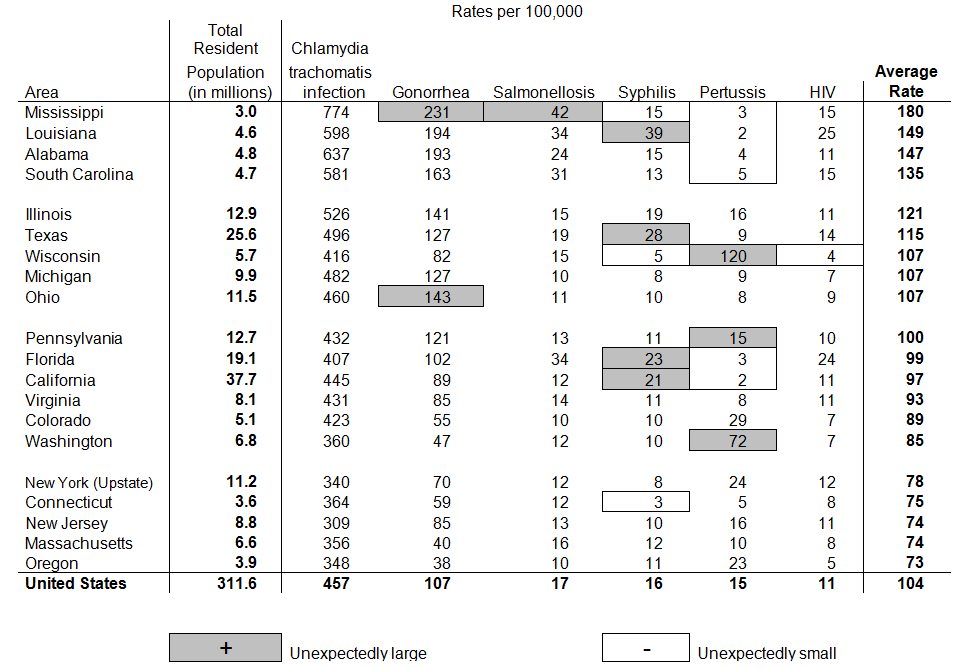
Table 5. Space according to data and indicate unusual points
This addition to the table allows us to see clusterings of states that were difficult to discern before.
We are almost done. The last step is to visually highlight unusual points – data values that are too large or too small for that state and that disease. Mississippi has an unusually high infection rate for Gonorrhea and also for Salmonellosis. Florida and California have higher than expected rates for Syphilis; Ohio is high for Gonorrhea. All four states that represent the Deep South have unexpected low rates of Pertussis infections, suggesting that they may have a different policy for childhood vaccination than they do for sex education. And, finally, Connecticut has an especially low rate of Syphilis.
Table 5 has the same information in it as Table 1 and yet it is so much more suggestive of plausible hypotheses. The most powerful suggestion emerges from the high number of infections for sexually transmitted infections (STIs) in the Deep South. A plausible explanation is limited access to sex education in those states. But is this true? A proxy for this variable would be the number of offices for Planned Parenthood in that state. In Table 6 we focus just on the STIs and append a column with the number of Planned Parenthood offices. The result is striking.
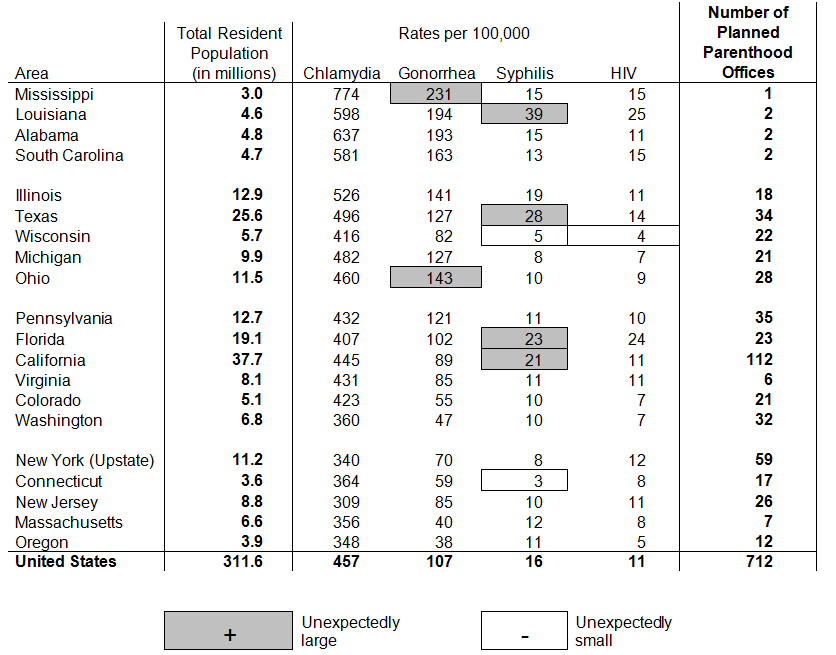
Table 6. STI infection rates and number of Planned Parenthood offices
Conclusion
There are many points of interest in Table 5 that we have not yet discussed. There is increased Salmonellosis in warm weather states, which is expected. In states, like Wisconsin and Washington, in which the movement against vaccinations has had some popularity we see unusually high levels of Pertussis. Such a result can be used to persuade parents of the efficacy of vaccinations. But the big story remains the STIs in the Deep South, and the augmentation (in Table 6) with Planned Parenthood information makes a compelling story.
The final revision of the table makes clear the most fundamental rule of data display; that you must think hard about the data being displayed to understand what is the point, and then think hard about how best to convey it.
Data do not speak for themselves. They can only tell their tale through you, and that only happens when you know what you are doing and why you are doing it. But, as we have shown, a few simple rules can transform a table worthy of the Farquhar’s scorn, into a data display that communicates quantitative phenomena effectively. A transformed table is so easy to do and is such a profound improvement on the traditional format that it is hard to imagine a reason for not following these simple rules. All that is lost by doing this is that we might find something that we otherwise would have missed. Repeating Monteux’s suggestion, if we’re going to present data in a table we might as well get the beat right. Here is one way to do it.
-
Howard Wainer is an American statistician, and the author of 21 books. His latest book, 'Truth or Truthiness: Distinguishing Fact from Fiction by Learning to Think Like a Data Scientist', is out now. See the February 2016 issue of Significance for an exclusive extract.
References
- Wainer, H. (2009). Picturing the Uncertain World: How to Understand, Communicate and Control Uncertainty through Graphical Display. Princeton, NJ: Princeton University Press.
- Farquhar, Arthur B. & Farquhar, Henry (1891). Economic and Industrial Delusions. New York: G. P. Putnam's Sons.
- Wainer, H. (2016). Truth or Truthiness: Distinguishing Fact from Fiction by Learning to Think like a Data Scientist. New York: Cambridge University Press.
- Wainer, H. (2014). Medical Illuminations: Using Evidence, Visualization & Statistical thinking to Improve Healthcare. London: Oxford University Press.
- Wainer, H. (2005). Graphic Discovery: A Trout in the Milk and Other Visual Adventures. Princeton, N.J.: Princeton University Press.
- Wainer, H. (2000). Visual Revelations: Graphical Tales of Fate and Deception from Napoleon Bonaparte to Ross Perot. (2nd edition) Hillsdale, N. J.: Lawrence Erlbaum Associates.
- As reported by Bressler, M. (1992). A Teacher Reflects, Princeton Alumni Weekly, November 25, pp. 11-14.
- Bertin, J. (1973). Semiologie Graphique. The Hague: Mouton-Gautier. 2nd Ed. (English translation done by William Berg & Howard Wainer and published as Semiology of Graphics, Madison, Wisconsin: University of Wisconsin Press, 1983.) and republished by ESRI Press in 2010.
- Wainer, H. & Schacht, S. (1978). Gapping. Psychometrika, 43, 203-212.


