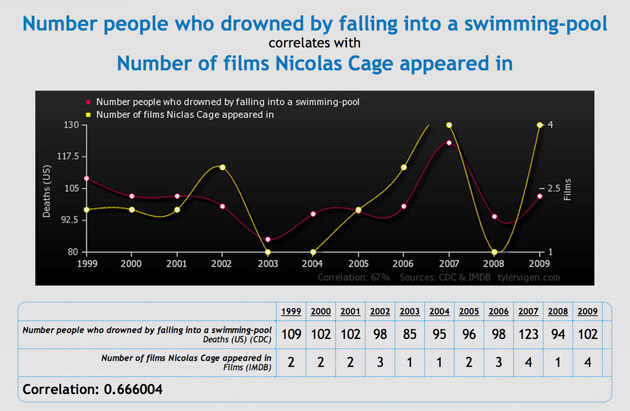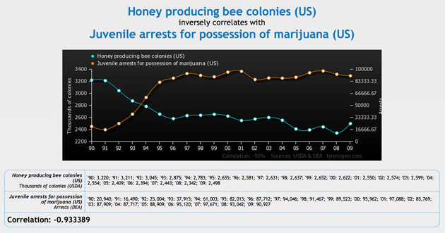
Actually no, that’s a silly conclusion to draw. What’s really going on is that both quantities – Methodist ministers and Cuban rum – were driven upwards by other factors, such as population growth.
In reaching that incorrect conclusion, we’ve made the far-too-common mistake of confusing correlation with causation.
What’s the difference?
Two quantities are said to be correlated if both increase and decrease together ('positively correlated'), or if one increases when the other decreases and vice-versa ('negatively correlated').
Correlation is readily detected through statistical measurements of the Pearson’s correlation coefficient, which indicates how tightly locked together the two quantities are, ranging from -1 (perfectly negatively correlated) through 0 (not at all correlated) and up to 1 (perfectly positively correlated).
But just because two quantities are correlated does not necessarily mean that one is directly causing the other to change. Correlation does not imply causation, just like cloudy weather does not imply rainfall, even though the reverse is true.
If two quantities are correlated then there might well be a genuine cause-and-effect relationship (such as rainfall levels and umbrella sales), but maybe other variables are driving both (such as pirate numbers and global warming), or perhaps it’s just coincidence (such as US cheese consumption and strangulations-by-bedsheet).
Even where causation is present, we must be careful not to mix up the cause with the effect, or else we might conclude, for example, that an increased use of heaters causes colder weather.
In order to establish cause-and-effect, we need to go beyond the statistics and look for separate evidence (of a scientific or historical nature) and logical reasoning. Correlation may prompt us to go looking for such evidence in the first place, but it is by no means a proof in its own right.
Subtle issues
Although the above examples were obviously silly, correlation is very often mistaken for causation in ways that are not immediately obvious in the real world. When reading and interpreting statistics, one must take great care to understand exactly what the data and its statistics are implying – and more importantly, what they are not implying.
One recent example of the need for caution in interpreting data is the excitement earlier this year surrounding the apparent groundbreaking detection of gravitational waves – an announcement that appears to have been made prematurely, before all the variables that were affecting the data were accounted for.
Unfortunately, analysing statistics, probabilities and risks is not a skill set wired into our human intuition, and so is all too easy to be led astray. Entire books have been written on the subtle ways in which statistics can be misinterpreted (or used to mislead). To help keep your guard up, here are some common slippery statistical problems that you should be aware of:
1) The Healthy Worker Effect, where sometimes two groups cannot be directly compared on a level playing field.
Consider a hypothetical study comparing the health of a group of office workers with the health of a group of astronauts. If the study shows no significant difference between the two – no correlation between healthiness and working environment – are we to conclude that living and working in space carries no long-term health risks for astronauts?
No! The groups are not on the same footing: the astronaut corps screen applicants to find healthy candidates, who then maintain a comprehensive fitness regime in order to proactively combat the effects of living in 'microgravity'.
We would therefore expect them to be significant healthier than office workers, on average, and should rightly be concerned if they were not.
2) Categorisation and the Stage Migration Effect – shuffling people between groups can have dramatic effects on statistical outcomes.
This is also known as the Will Rogers effect, after the US comedian who reportedly quipped:
'When the Okies left Oklahoma and moved to California, they raised the average intelligence level in both states.'
To illustrate, imagine dividing a large group of friends into a 'short' group and a 'tall' group (perhaps in order to arrange them for a photo). Having done so, it’s surprisingly easy to raise the average height of both groups at once.
Simply ask the shortest person in the 'tall' group to switch over to the 'short' group. The 'tall' group lose their shortest member, thus bumping up their average height – but the 'short' group gain their tallest member yet, and thus also gain in average height.
This has major implications in medical studies, where patients are often sorted into 'healthy' or 'unhealthy' groups in the course of testing a new treatment. If diagnostic methods improve, some very-slightly-unhealthy patients may be recategorised – leading to the health outcomes of both groups improving, regardless of how effective (or not) the treatment is.
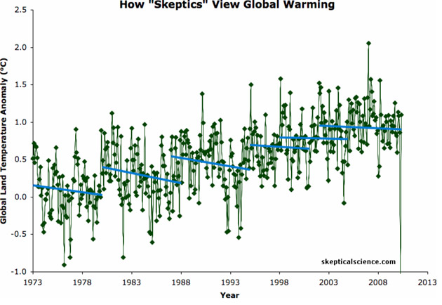
Picking and choosing among the data can lead to the wrong conclusions. The skeptics see period of cooling (blue) when the data really shows long-term warming (green).
3) Data mining – when an abundance of data is present, bits and pieces can be cherry-picked to support any desired conclusion.
This is bad statistical practice, but if done deliberately can be hard to spot without knowledge of the original, complete data set.
Consider the above graph showing two interpretations of global warming data, for instance. Or fluoride – in small amounts it is one of the most effective preventative medicines in history, but the positive effect disappears entirely if one only ever considers toxic quantities of fluoride.
For similar reasons, it is important that the procedures for a given statistical experiment are fixed in place before the experiment begins and then remain unchanged until the experiment ends.
4) Clustering – which is to be expected even in completely random data.
Consider a medical study examining how a particular disease, such as cancer or Multiple sclerosis, is geographically distributed. If the disease strikes at random (and the environment has no effect) we would expect to see numerous clusters of patients as a matter of course. If patients are spread out perfectly evenly, the distribution would be most un-random indeed!
So the presence of a single cluster, or a number of small clusters of cases, is entirely normal. Sophisticated statistical methods are needed to determine just how much clustering is required to deduce that something in that area might be causing the illness.
Unfortunately, any cluster at all – even a non-significant one – makes for an easy (and at first glance, compelling) news headline.
Statistical analysis, like any other powerful tool, must be used very carefully – and in particular, one must always be careful when drawing conclusions based on the fact that two quantities are correlated.
Instead, we must always insist on separate evidence to argue for cause-and-effect – and that evidence will not come in the form of a single statistical number.
Seemingly compelling correlations, say between given genes and schizophrenia or between a high fat diet and heart disease, may turn out to be based on very dubious methodology.
We are perhaps as a species cognitively ill prepared to deal with these issues. As Canadian educator Kieran Egan put it in his book Getting it Wrong from the Beginning:
'The bad news is that our evolution equipped us to live in small, stable, hunter-gatherer societies. We are Pleistocene people, but our languaged brains have created massive, multicultural, technologically sophisticated and rapidly changing societies for us to live in.'
In consequence, we must constantly resist the temptation to see meaning in chance and to confuse correlation and causation.
![]()
This article first appeared on The Conversation website.


