
In 19th century Vienna, a young physician named Ignác Semmelweis discovered that doctors’ dirty hands led to deaths in his maternity clinic. It was a turning point in medical science, saving countless lives. We can now use modern statistical techniques on Semmelweis’s own data to discover how effective his handwashing protocols were
It’s spring in 1847 Vienna. At the city’s renowned general hospital, a young doctor is about to introduce a major change to the maternity clinic where he is employed as an assistant to a distinguished professor of obstetrics. Since arriving at the clinic as a trainee several years ago, he has become increasingly disturbed by the high numbers of women developing fevers and dying after giving birth. Having observed that death rates are consistently lower in the hospital’s other maternity clinic, which is staffed exclusively by midwives rather than doctors and medical students, he has sought for months to find an explanation for the disparity. His latest theory has been inspired by a painful personal loss: the death of his friend, a pathologist at the hospital. This pathologist had been fit and well until, shortly after a student accidentally scratched him with a scalpel during a post-mortem, he had begun to display similar symptoms to many of the dying mothers on the maternity wards.
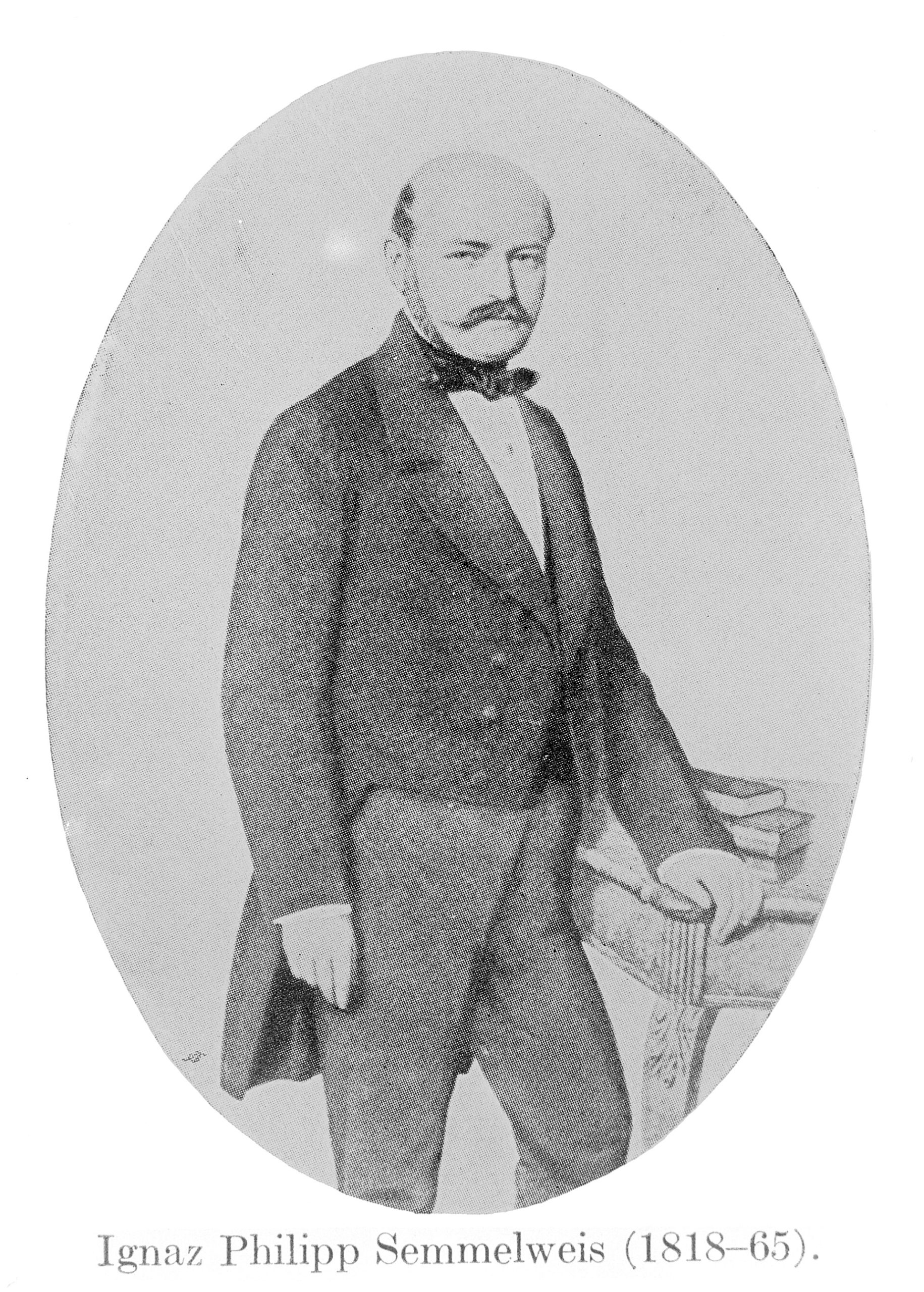
Ignác Semmelweis. Photo courtesy of Wellcome Collection/Creative Commons CC-BY-4.0
In the wake of this incident, the young doctor has identified a crucial difference between the hospital’s two obstetrical clinics: unlike midwives, the doctors and medical students staffing his clinic often perform dissections and autopsies as part of their training. And, he has realised, they are using the same hands to examine cadavers and living patients. He has therefore decided to insist that, from this day forth, all physicians and trainees must scrub their hands with a diluted chlorine solution before they proceed from the autopsy room to the clinic.
***
The young doctor in this story, desperate to find out why his patients kept dying, was Ignác Semmelweis – a fascinating figure in the history of medicine1. So, did his handwashing dictate work? If so, how can we tell, and how dramatic was the effect? We can have a go at answering these questions using modern statistical techniques because, in 1861, Semmelweis published a book on his findings that was filled with tables of data2. In these tables, we can find the monthly volume of admissions to the doctor-staffed clinic from January 1841 until March 1849, as well as the numbers of women who died on the clinic’s maternity ward during those months3.
 Table 1: An extract of Semmelweis’ monthly data.
Semmelweis introduced his new chlorine solution in mid-May 1847, and, looking at Table 1, it certainly seems that we can spot an effect in his data; in June, there were approximately 2 deaths for every 100 women admitted to the clinic, compared to just over 18 in April. Sceptics, however, might argue that mortality had been decreasing over time anyway or that this difference was purely down to chance or seasonal factors. For a better understanding of the evidence than a comparison of two data points can give us, we need to turn to statistics.
Measuring impact
Today, randomised controlled trials (RCTs) – in which participants are randomly assigned to treatment and control groups – are considered the most reliable way to investigate the effectiveness of medical interventions. However, RCTs did not become widely used in healthcare research until the 20th century, decades after Semmelweis’ death. Even now, evidence from RCTs is not always available – for instance, when a public health measure has been applied to an entire population with no control group. In situations such as these, one way that statisticians can evaluate the effectiveness of an intervention is to perform an ‘interrupted time series analysis’ (ITSA). This type of study has been used to investigate public health programmes as diverse as 20mph speed restrictions, paracetamol pack size limitations and vaccination drives4. As well as deliberate interventions, interrupted time series analyses can also shed light on the effects of unexpected events; for example, researchers from the University of Oxford have recently been using them to explore the impacts of the Covid-19 pandemic on prescriptions of opioids and antidepressants in the UK5,6. (ITSA was also used by Ashley Mullen in a recent Significance article to investigate the effect of a ‘will-they-won’t-they’ couple finally getting together on TV show ratings7!)
The simplest form of interrupted time series analysis is segmented linear regression, which, as its name suggests, is an adaptation of one of the statistician’s most trusty tools – linear regression. In a nutshell, linear regression aims to describe relationships in our data using straight lines with the famous formula everyone has to learn in school: y=mx+c. This means that if we have a set of data points that each record a variable, x (say, a person’s height), and a ‘response’, y (their lung capacity, for example), we can use linear regression to identify the straight line that best captures the association between these variables. To do this, we assume that y depends on x according to the equation y=ɑ+βx+ε. Here, the ɑ+βx bit is equivalent to the familiar mx+c from the equation of a straight line, and the ε term represents all the stuff that x cannot explain – other factors, measurement errors and let’s not forget random variation!
We can use linear regression to model trends over time by letting x represent the days, months or years since the start of our study8. In this case, β – the gradient of our fitted straight line – will tell us the average change in y over each time step, and we can interpret ɑ – its intercept – as the level from which the line starts. In interrupted time series analysis, we want to know if an intervention has changed the course of the prevailing trend – to investigate this, we can apply segmented linear regression, which means fitting a regression model that includes terms for time, the intervention, and time since the intervention. This approach yields two estimates for ɑ, describing the baseline level and the change from baseline, as well as two β estimates for both the initial trend and the change in this trend associated with the intervention. Segmented regression therefore allows us to assess changes in both the level and trend of the response variable. In our analysis of Semmelweis’ data, for example, the response variable is the monthly maternal mortality rate, and segmented regression helps us determine the extent to which his intervention affected this outcome.
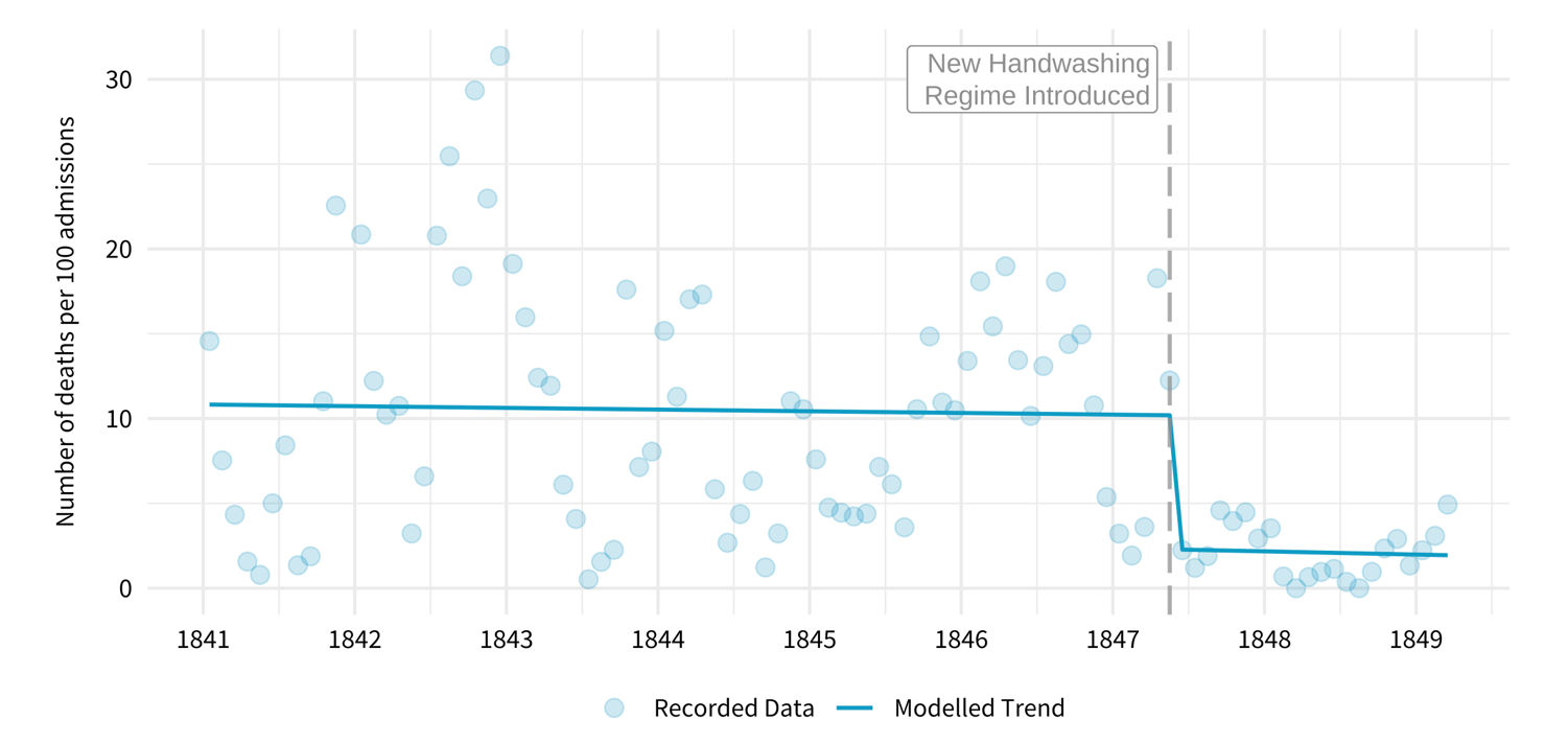 Figure 1: A segmented linear regression model fitted to Semmelweis’ data.
Applying segmented linear regression to the recorded numbers of admissions and deaths of new mothers at the Vienna General Hospital between 1841 and 1849 gives us quite a striking picture (Figure 1). The model we’ve fitted indicates that the monthly death rate was decreasing only marginally until May 1847, at which point it dropped sharply. Before we plough ahead and start trying to interpret the results of this model more quantitatively, though, we should stop and consider the potentially false premises on which it rests.
When you assume…
Hiding in the equation y=ɑ+βx+ε are some pretty important assumptions. The first is that the errors, ε, are normally distributed around zero, following a symmetrical bell-shaped curve. This means that the response variable, y, is equally deviate from the prediction ɑ+βx by -10 as +10. But in the context of data on mortality, this assumption doesn’t really make sense because the number of deaths can’t be lower than zero. We can see this when we plot the ‘residuals’ – the differences between our predictions and the recorded data – from our model (Figure 2a); they aren’t symmetrical, suggesting that our data violates this requirement of linear regression. To sidestep this problem, we can use Poisson regression instead, a type of model which is better suited to working with ‘count’ variables like numbers of deaths8, and which doesn’t make this normality assumption.
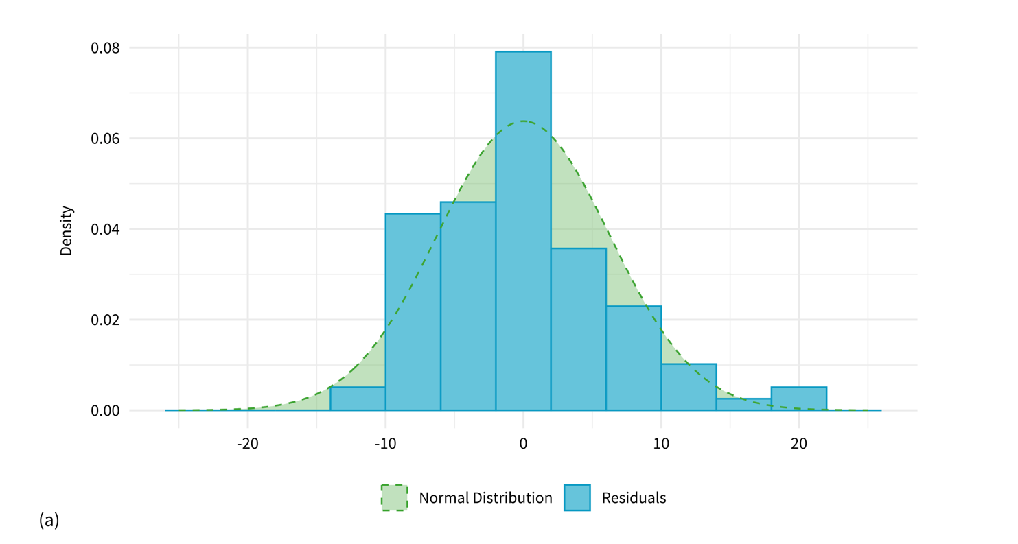
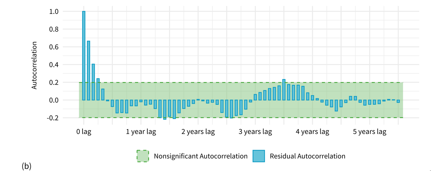 Figure 2: (a) The residuals of our segmented linear regression model compared to a normal distribution. (b) The correlation between these residuals over time.
Another assumption lurking behind that pesky ε term in the linear regression model is that the errors are independent from each other. This is quite a dubious proposition to accept when we’re working with data points ordered in time, where factors influencing one month’s death rates are likely also to affect patients’ risk of death in the surrounding months. We can see this when we plot the degree of correlation between the residuals of predictions from our segmented linear regression model that are separated by certain numbers of months (Figure 2b). The peaks and troughs in this graph suggest that our death rate data points follow a periodic pattern – perhaps rising predictably during certain seasons, such as the winter flu months – and are therefore not well represented by a straight line. To try and account for seasonality, we can modify our Poisson regression model to estimate a different baseline risk for each calendar month.
Switching from straightforward linear regression to seasonally adjusted Poisson regression will help us model Semmelweis’ data more accurately, but we aren’t out of the woods yet. Though Poisson regression doesn’t require our errors to be normally distributed, it does make certain assumptions about the dispersion – or ‘spread’ – of our data, which are unlikely to hold in practice. Stratifying risk by calendar month will help us to account for seasonal variation in mortality rates, but it won’t resolve all of the residual autocorrelation caused by the uneven clustering of deaths over time. A common way of addressing this situation is to appropriately adjust our quantification of the uncertainty around these estimates, which we can do using ‘robust standard errors’ – a widely used technique in econometrics8. This will widen any confidence intervals we produce around our calculated effect sizes, to reduce the chances of falsely declaring a statistically significant result.
The final verdict
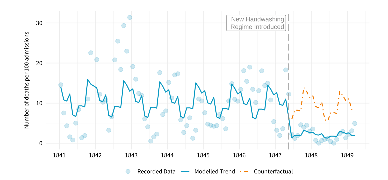 Figure 3: A seasonally adjusted segmented Poisson regression model fitted to Semmelweis’ data. The orange dotted line shows the predicted trend in death rates had Semmelweis not intervened.
Now we can finally return to our investigation of Semmelweis’ impact on maternity patients’ risk of death. Using a fitted segmented Poisson regression model with robust standard errors, we are able to obtain an estimate for the reduction in deaths per 100 admissions following the introduction of the chlorine handwashing solution of 77%, with a corresponding 95% confidence interval of (21%, 93%).
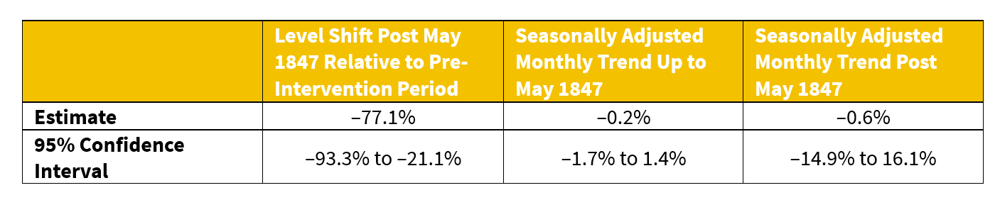 Table 2: Changes in the number of maternal deaths per 100 admissions according to our fitted segmented Poisson regression model. Confidence intervals have been adjusted to account for overdispersion and autocorrelation. In May 1847 there were approximately 12 deaths per 100 admissions.
To put this number into context, let’s consider the number of deaths that it implies may have been averted by Semmelweis’ handwashing dictate. Between his intervention in May 1847 and the end of his contract with the Vienna General Hospital in March 1849, 142 women tragically died after being admitted to the doctors’ clinic. Had the handwashing regime not been in place, however, our model suggests that this number could instead have been 142/(1-0.7706)=619, meaning that 477 more lives would have been lost. Clean hands really did save lives.
Semmelweis’ legacy
I would like to be able to say that, following the publication of Semmelweis’ book, his ideas on handwashing were embraced and doctors everywhere started enthusiastically disinfecting their hands. The unfortunate truth, however, is that Ignác Semmelweis never had much of a substantial impact on medical practice beyond the walls of the Vienna General Hospital, and it was not until several decades after his death that antiseptic techniques began to be widely introduced in hospitals across the world1. This was partially due to the fact that Semmelweis’ findings could not be easily explained by the miasmatic theory of disease – a paradigm which held that contagious illnesses were spread via ‘bad air’ and which, at the time he was writing, was yet to be displaced by germ theory. Semmelweis’ lack of success in spreading his message has also been attributed to his combative personality9; his abrasiveness is exemplified in the 208 pages of his 1861 book he dedicated to attacking obstetricians who had not accepted his ideas, casting them as ignorant murderers1.

Marble statue of Semmelweis in front of the Szent Rókus Hospital in Budapest, Hungary. Photo courtesy of Wellcome Collection/Creative Commons CC-BY-4.0
So, what lessons can we learn from Semmelweis’ story? Modern retellings of the events of his life have, understandably, often focused on the failures of those involved – Semmelweis’ own, in the ways he chose to communicate his results, and the medical community’s, in their inability to accept evidence that did not fit the established consensus. But perhaps there’s a positive lesson we can draw from the story as well. The fact that Semmelweis was able to save so many lives with a simple chlorine solution demonstrates that quality improvement initiatives in healthcare and other fields don’t necessarily need to be based on expensive and cutting-edge technology in order to have a substantial impact. I was reminded of this truth recently when reading a book by the surgeon Atul Gawande about the power of checklists in medicine10. In it, he tells the story of a critical care doctor, Peter Pronovost, who helped to reduce the ten-day infection rate of central lines placed in his intensive care unit from eleven to zero percent. He and his colleagues achieved this feat by requiring the clinicians in the ICU to make sure they followed a five-point checklist of sterilisation procedures each time they inserted a central line – a low-cost intervention which, by their calculations, may have prevented up to 15 deaths during the period of the study11. Semmelweis would surely have approved.
References
- Nuland, S. (2004) The Doctors’ Plague: Germs, Childbed Fever, and the Strange Story of Ignác Semmelweis. New York: W. W. Norton and Company.
- Semmelweis, IP. (1983) The Etiology, Concept, and Prophylaxis of Childbed Fever. Translated by KC. Carter. Madison, WI: University of Wisconsin Press.
- Stang, A., Standl, F. and Poole, C. (2022) A twenty‑first century perspective on concepts of modern epidemiology in Ignaz Philipp Semmelweis’ work on puerperal sepsis. European Journal of Epidemiology, 37, 437–445.
- Bernal, JL., Cummins, S. and Gasparrini, A. (2016) Interrupted time series regression for the evaluation of public health interventions: a tutorial. International Journal of Epidemiology, 46(1), 348–355.
- Schaffer, AL. et al. (2024) Changes in opioid prescribing during the COVID-19 pandemic in England: an interrupted time-series analysis in the OpenSAFELY-TPP cohort. The Lancet Public Health, 9(7), e432–e442.
- Cunningham, C. et al. (2024) The impact of the COVID-19 pandemic on Antidepressant Prescribing with a focus on people with learning disability and autism: An interrupted time-series analysis in England using OpenSAFELY-TPP. medRxiv [Preprint].
- Mullan, A. (2025) For better or for worse: The “kiss effect” on television ratings. Significance, 22(6-7), 30–33.
- Wooldridge, J. (2013) Introductory Econometrics: A Modern Approach. 5th edn. Mason, OH: Cengage Learning.
- Stewardson, A. and Pittet, D. (2011) Ignác Semmelweis—celebrating a flawed pioneer of patient safety. The Lancet, 378(9785), 22–23.
- Gawande, A. (2011) The Checklist Manifesto: How to Get Things Right. London: Profile Books.
- Berenholtz, SM. et al. (2004) Eliminating catheter-related bloodstream infections in the intensive care unit. Critical Care Medicine, 32(10), 2014–2020.
Becky Griffiths is a mathematics graduate from the University of Bristol who is currently studying for an MSc in health data science at the University of Exeter, UK. This article was a finalist for the 2025 Statistical Excellence Award for Early Career Writing. The 2026 writing award is now closed. The 2027 competition will open in February 2027.
You might also like: Interweaving probability and crochet: A stati-stitchin’s guide
Punch-cards, concentration camps and René Carmille